How the Chart is inserted in PowerPoint


Learn how to insert and customize charts in PowerPoint to effectively present your data.
Charts are powerful tools for visualizing data and making your presentations more engaging and informative.
PowerPoint provides a variety of chart types that can be easily inserted into your slides, helping you to convey complex data in a clear and concise manner.
In this blog post, we'll guide you through the steps to insert a chart in PowerPoint, ensuring that your data is presented effectively.
How to Insert a Chart in PowerPoint
Step 1: Open Your PowerPoint Presentation
Before inserting a chart, make sure you have your PowerPoint presentation open:
Launch PowerPoint: Open the PowerPoint application on your computer and either create a new presentation or open an existing one where you want to insert the chart.
Navigate to the Slide: Select the slide where you want to insert the chart. If necessary, create a new slide by clicking on the "New Slide" button in the ribbon.
Step 2: Insert a Chart
PowerPoint makes it simple to add a chart to your slide:
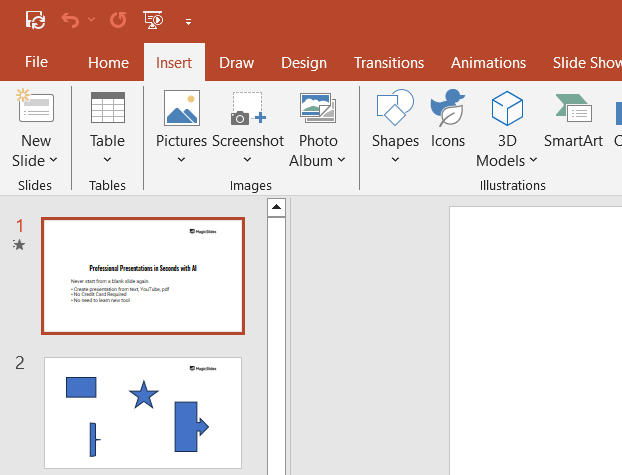
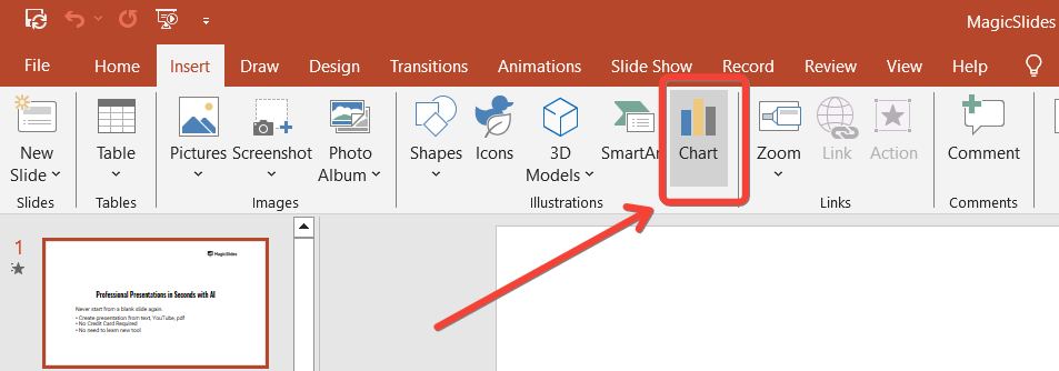
- Go to the Insert Tab: In the PowerPoint ribbon at the top of the screen, click on the "Insert" tab to access the chart options.
- Select Chart: In the "Insert" tab, locate the "Chart" button. Click on it to open the "Insert Chart" dialog box.
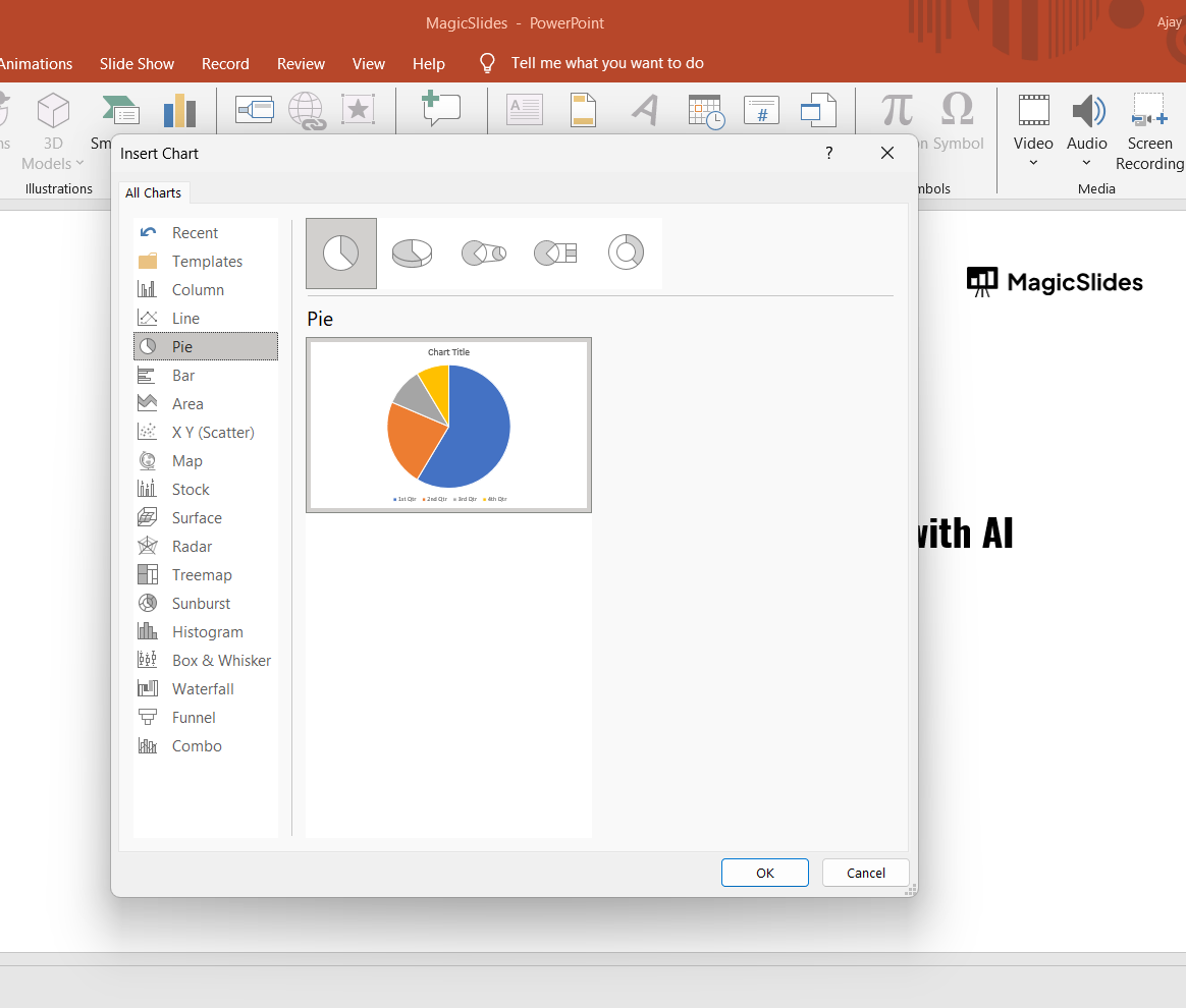
- Choose a Chart Type: In the "Insert Chart" dialog box, you'll see a variety of chart types such as Column, Line, Pie, Bar, Area, and more. Select the chart type that best suits your data presentation needs.
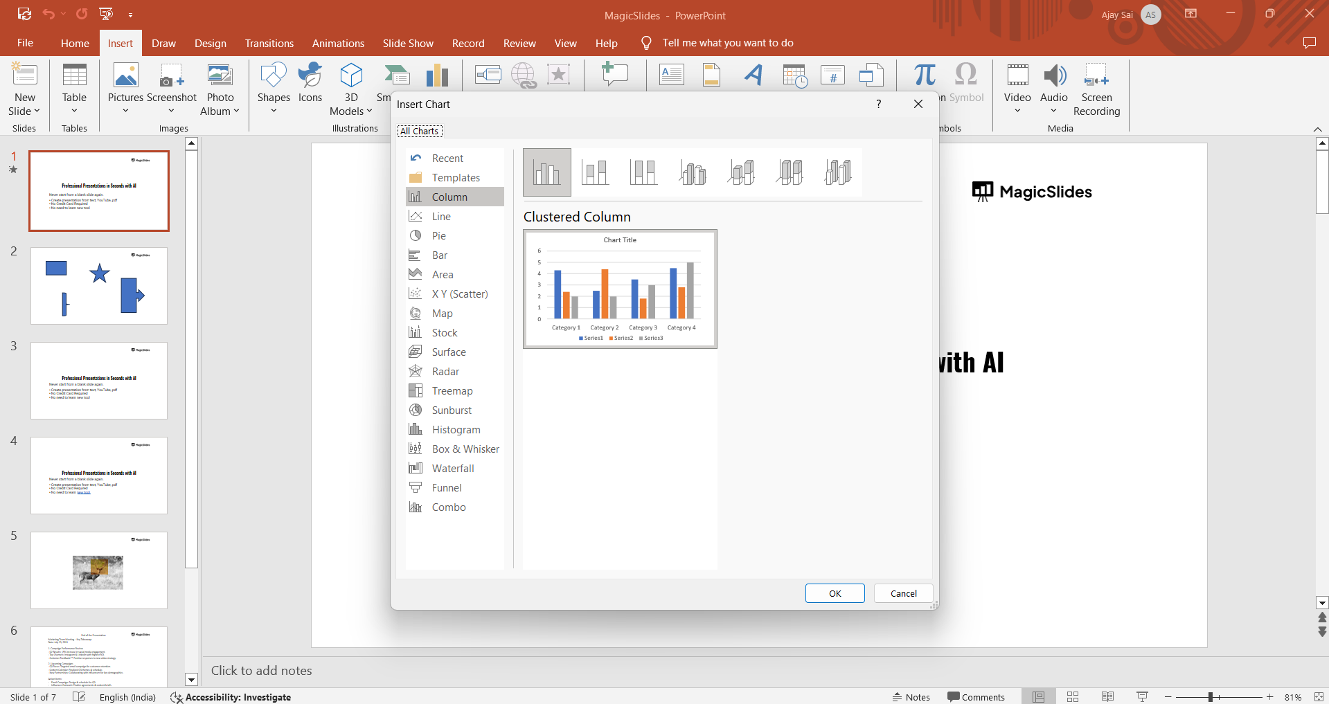
- Insert the Chart: Once you've selected your desired chart type, click "OK." PowerPoint will insert the chart into your slide and open an Excel sheet where you can enter your data.
Step 3: Enter Your Data
After inserting the chart, you'll need to populate it with data:
- Edit Data in Excel: A small Excel window will appear, allowing you to enter the data that will be displayed in the chart. Replace the placeholder data with your own values. The chart on your slide will automatically update as you enter your data.
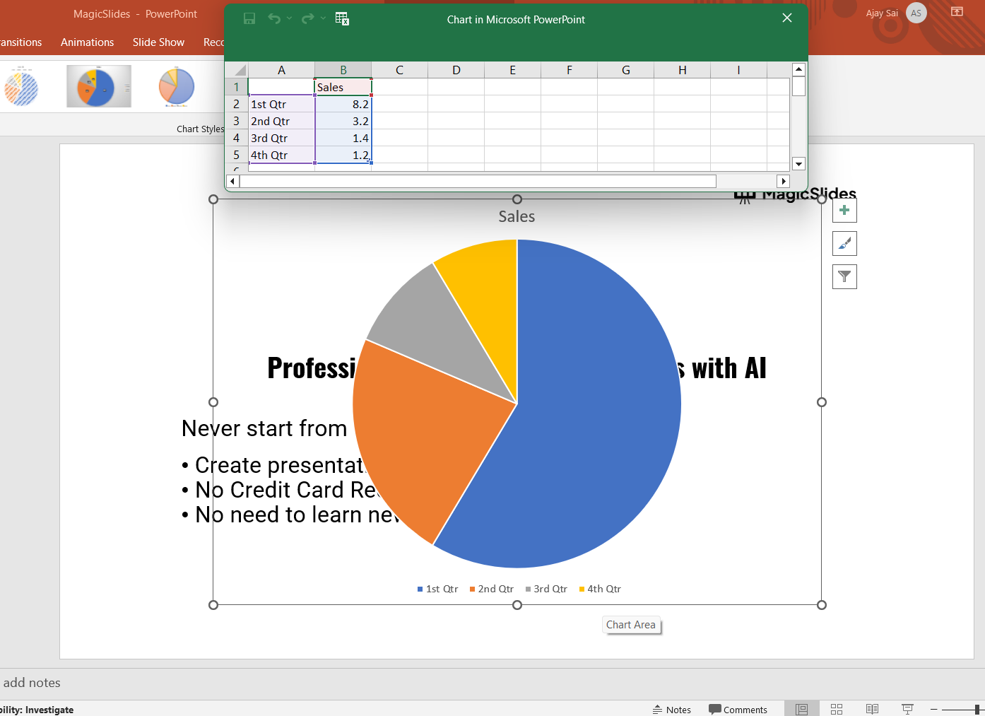
Customize Data Range: If your data range is larger or smaller than the default, drag the blue outline in the Excel sheet to include the necessary rows and columns.
Close Excel: Once you've entered all your data, close the Excel window. Your chart will now display the updated information on your slide.
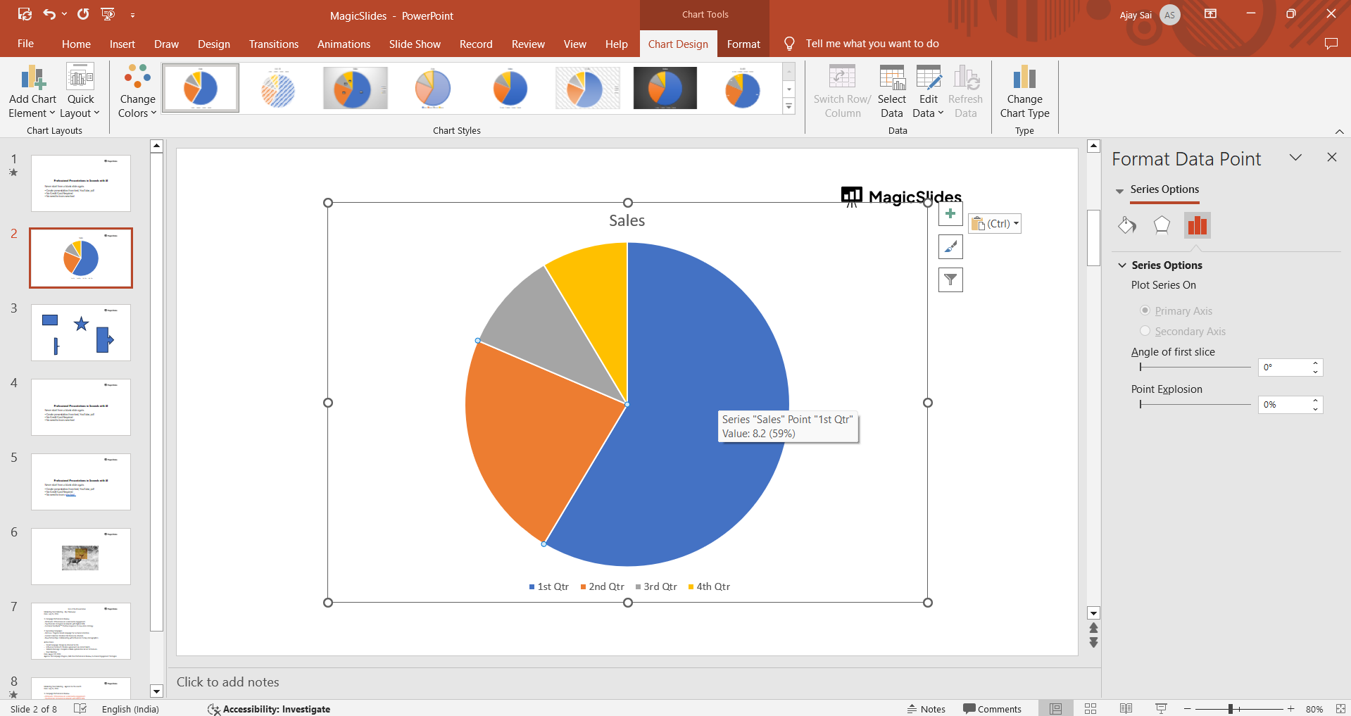
Step 4: Customize the Chart
PowerPoint allows you to customize the chart to better match your presentation style:
Format the Chart: In the "Format" tab, you can adjust the chart's colors, fonts, and effects to match your presentation theme. You can also change the size and position of the chart on the slide.
Learn how to effectively compress PowerPoint presentations with our easy step-by-step guide, enhancing shareability and performance.
Step 5: Review and Finalize Your Slide
Before concluding your work on the chart, it's important to review and ensure everything is in order:
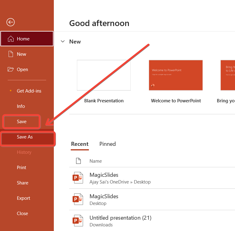
Save Your Presentation: After finalizing your chart, save your presentation by clicking "File" > "Save" or "Save As" to ensure your changes are preserved.
Conclusion
Inserting a chart in PowerPoint is a straightforward process that can significantly enhance your presentation by visually representing data.
By following these steps, you can create a chart that not only looks professional but also effectively communicates your message.
Whether you're presenting sales figures, survey results, or any other type of data, charts can help make your information more accessible and engaging for your audience.
Tired of making presentations? what if we tell you you can make a presentation with just a prompt, convert YouTube videos to PPTs, convert website content to PPTs? Yes! checkout magicslides.app that does all and enjoy the free credits to make presentations in seconds.
FAQs are here to guide you!
What types of charts can I insert in PowerPoint?
You can insert various charts such as Column, Line, Pie, Bar, Area, and more, depending on your data presentation needs.
How do I enter data into the chart in PowerPoint?
After inserting the chart, PowerPoint opens an Excel window where you can input your data. The chart updates automatically as you enter your values.
Can I customize the appearance of my chart in PowerPoint?
Yes, you can customize your chart's style, layout, colors, fonts, and more using the "Design" and "Format" tabs in the Chart Tools.


