How To Add Charts In Google Docs?


Learn how to effortlessly integrate visually appealing charts into your Google Docs documents for clearer data representation and analysis.
Google Docs is a powerful tool for creating and editing documents collaboratively. While it's known for its text-based capabilities, did you know you can also easily add charts to your documents? Whether you're presenting data or simply adding visual appeal, incorporating charts can enhance the effectiveness of your documents. In this guide, we'll walk you through the process of adding charts in Google Docs, step by step.
How To Add Charts In Google Docs?
Before you begin, ensure you have a Google Docs document open where you want to insert the chart. Now, let's dive into the process.
Step 1: Sign in and Open Google Docs
Begin by signing in to your Google account and navigating to Google Docs. If you're already signed in, you can access Google Docs directly from the Google Apps menu.
Step 2: Access the Insert Tab
Once you have your document open, locate the Insert tab at the top of the screen. Click on it to reveal a dropdown menu of options.
Step 3: Insert a Chart
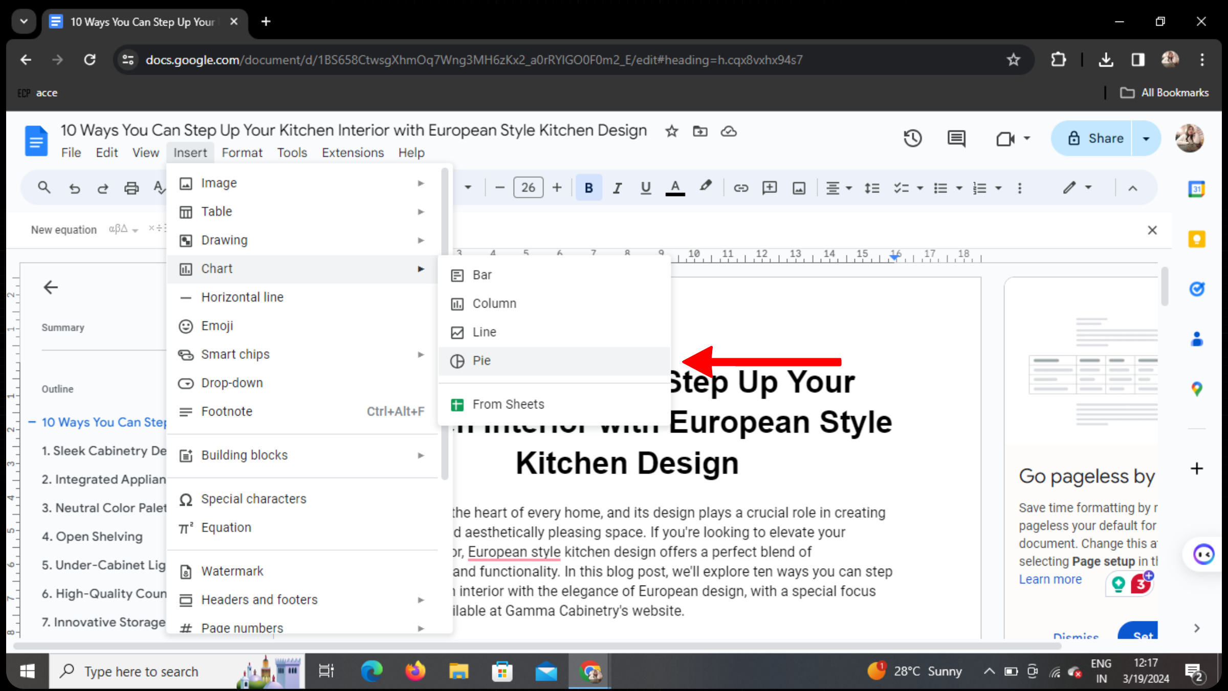
In the dropdown menu, you'll find various options. Look for Chart and click on it. This will prompt a submenu to appear.
Step 4: Choose Chart Type
From the submenu, you can select the type of chart you want to insert. Options include pie charts, bar graphs, line charts, and more. For this example, let's choose a pie chart.
Step 5: Customize Your Chart
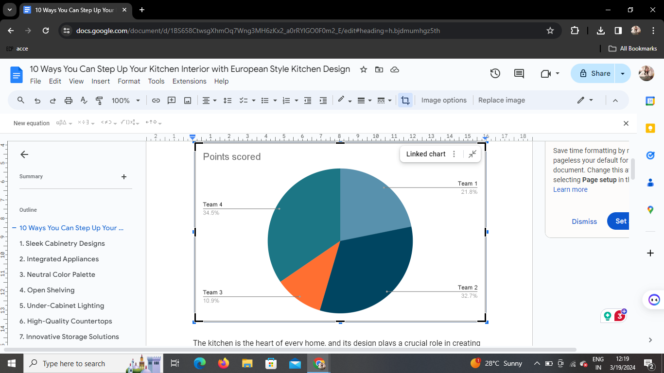
Once you've selected the type of chart, a default chart will appear in your document. You can now customize it to suit your preferences. Click on the chart to reveal editing options such as data, labels, colors, and more.
Step 6: Edit as Needed
With the chart selected, you can make adjustments such as adding or removing data, changing the chart title, adjusting colors, and modifying the chart style. Experiment with different settings until you're satisfied with the appearance of your chart.
Conclusion
Adding charts to your Google Docs documents is a straightforward process that can significantly enhance the visual appeal and clarity of your content. Whether you're presenting data to colleagues, students, or clients, incorporating charts can help convey information more effectively. With the simple steps outlined in this guide, you can easily create and customize charts to suit your needs.
FAQs
Can I edit the chart after inserting it into Google Docs?
Yes, you can edit the chart by clicking on it and accessing the editing options that appear.
Can I insert multiple charts into the same document?
Absolutely! You can insert as many charts as you need within a single Google Docs document.
Can I import data from Google Sheets to create a chart in Google Docs?
While you can't directly import data from Google Sheets into Google Docs charts, you can copy and paste data from Sheets into Docs to create your chart.
Can I resize the chart in Google Docs?
Yes, you can resize the chart by clicking and dragging its edges to adjust its dimensions.
Can I collaborate on editing the chart with others in real-time?
Yes, Google Docs allows for real-time collaboration, so you and your collaborators can work together on editing the chart simultaneously.


