How to Make Google Slides Look Good?


Learn to create visually stunning Google Slides with essential design tips, image use, and effective presentation techniques.
Creating a compelling Google Slides presentation is about more than just conveying information—it's about telling a story that captivates and persuades your audience.
Whether you're presenting a business proposal, an academic report, or a creative pitch, the visual appeal of your slides can significantly impact how your message is received.
Below, I’ll guide you through the process of designing Google Slides that are not only informative but also aesthetically pleasing and engaging.
Understanding the Basics of Design
Before diving into the specifics, it’s important to grasp some basic design principles that can transform your presentation:
- Contrast: This principle helps to draw attention to key elements on your slide. Use contrasting colors for text and background to ensure readability.
- Repetition: Consistency in fonts, colors, and layout throughout the presentation helps create a cohesive look.
- Alignment: Proper alignment adds a clean, organized appearance to your slides. Avoid placing elements haphazardly.
- Proximity: Group related items together to help organize information and guide the viewer’s eye through the slide.
Choosing the Right Theme
Google Slides offers a variety of themes, but choosing the right one sets the tone for your entire presentation. Select a theme that reflects the subject matter and mood of your presentation.
For corporate presentations, stick to professional and clean themes. For more creative topics, you might opt for something more dynamic and colorful.
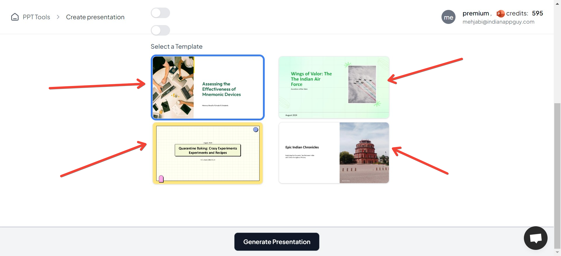
For example, if you generate a presentation using MagicSlides, you can choose from different themes for your presentation!
Customizing Your Theme
- Backgrounds: A subtle background image or a slight gradient can add depth to your slides without overpowering the content.
- Fonts: Choose fonts that are easy to read and appropriate for the context. For example, sans-serif fonts like Arial or Helvetica are generally good for presentations because they’re legible from a distance.
Enhancing Visual Appeal with Images and Graphics
Images and graphics play a crucial role in making your slides visually appealing:
- High-Quality Images: Always use high-resolution images that support and enhance your message.
- Infographics: Convert complex data into easy-to-understand infographics. Tools like Canva or Adobe Spark can help you design these elements even if you're not a professional graphic designer.
- Icons: Use icons to highlight key points. Ensure they’re consistent in style and color.
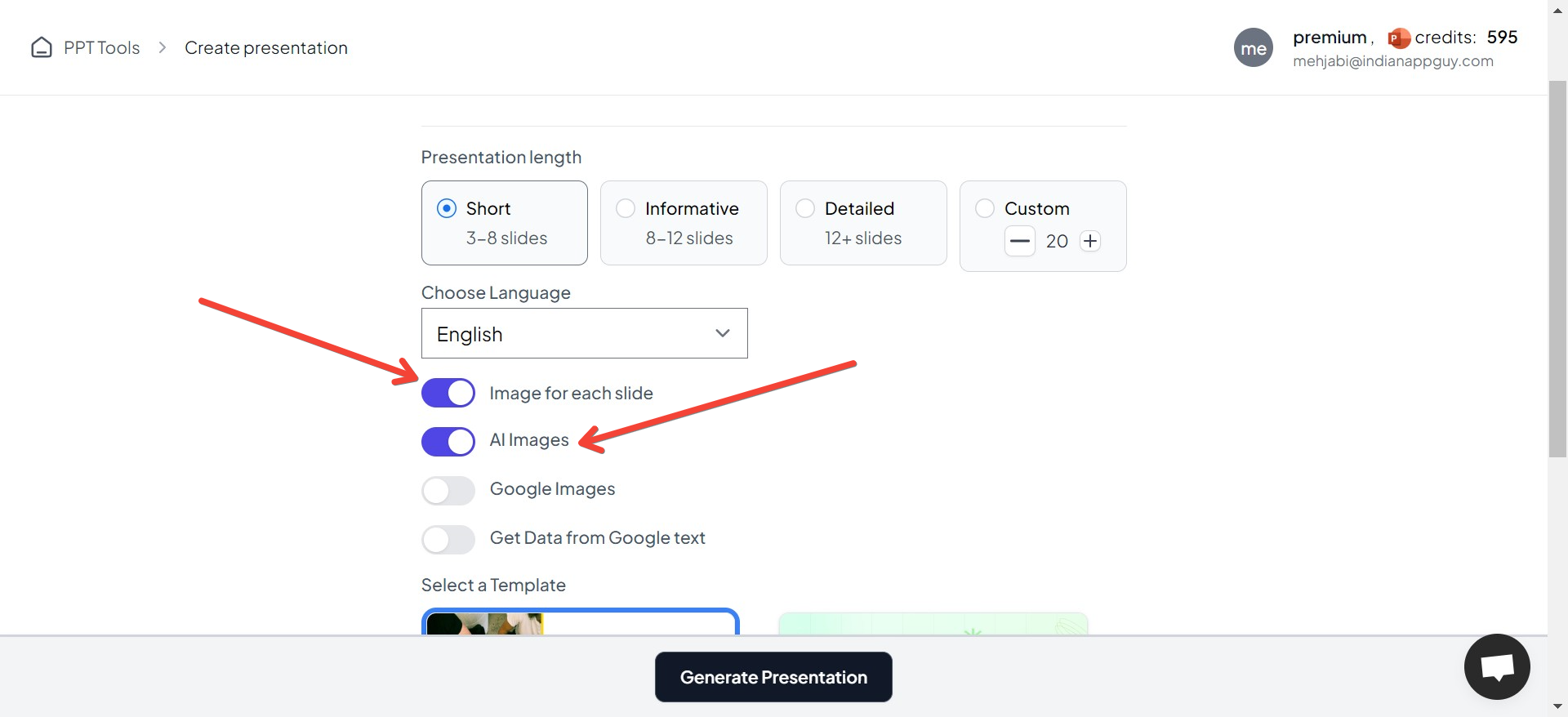
Generating a presentation using MagicSlides can help you choose images as per your preference, i.e. AI images, etc.
Effective Use of Colors
Color can evoke emotions and give your slides a polished look. Use your brand colors or choose a palette that supports the tone of your presentation. Tools like Coolors or Adobe Color can help you find complementary color schemes.
Typography Matters
Typography is not just about choosing fonts; it's about how text interacts with other elements on the slide. Keep these tips in mind:
- Hierarchy: Use different font sizes to establish a hierarchy of information.
- Spacing: Adequate space around the text improves readability.
- Bullets and Numbers: Use them for lists to organize information neatly.
Utilizing Animations and Transitions
Animations and transitions should enhance the storytelling aspect of your presentation without distracting from the main content:
- Subtle Transitions: Use simple transitions like 'Fade' or 'Push' between slides.
- Meaningful Animations: Apply animations to make data appear dynamically or to emphasize a point but avoid overusing them.
Mastering the Layout
Good layout helps to balance elements visually and keep the audience focused on what matters:
- Grids and Guides: Use grids to keep your layouts clean and aligned.
- Whitespace: Don’t be afraid to leave space unoccupied. It can help avoid clutter and make important elements stand out.
Preparation and Practice
Finally, no matter how well-designed your slides are, the effectiveness of your presentation largely depends on your delivery:
- Rehearse: Practice your presentation multiple times to ensure smooth delivery.
- Feedback: Get feedback from peers before the final presentation to refine and improve your slides.
Conclusion
Making your Google Slides presentation look good is an art that combines design knowledge with a clear understanding of your content and audience.
By focusing on design basics, choosing the right visuals, and practicing your delivery, you can create Google Slides presentations that are both beautiful and effective.
Remember, a well-designed presentation can make a big difference in how your message is perceived. Keep your audience in mind, and don't hesitate to put in that extra effort to make your slides outstanding!


