What Role Does Design Play in a Successful Presentation?


Discover the role of design in successful presentations. Explore how presentation design templates, like those from MagicSlides, enhance clarity, engagement, and impact.
No matter how great your ideas are, poor presentation design can dull their impact. Design isn’t just about aesthetics—it’s about making your message clear, engaging, and memorable.
Let’s explore why design is so critical to a successful presentation and how choosing the right presentation design templates can elevate your work.
Why Presentation Design Matters
- First Impressions Count Your slides are often the first thing your audience notices, even before you start speaking. A clean, professional design immediately establishes credibility and sets the tone for the rest of your presentation.
- Enhances Understanding Well-designed visuals make complex information easier to understand. Whether it’s a carefully crafted chart or an infographic, good design ensures that your key points aren’t lost in clutter or confusion.
- Keeps Attention Let’s face it—audiences can get distracted. Engaging design with consistent layouts, striking visuals, and logical flow helps keep their attention where it belongs: on your message.
- Builds Emotional Connection Colors, images, and typography can evoke emotions and create a mood that reinforces your message. A presentation on innovation, for example, might benefit from sleek, modern designs, while a talk about sustainability might use earthy tones and organic shapes.
The Building Blocks of Great Presentation Design
1. Typography
- Use clean, readable fonts for your main content.
- Experiment with bold, larger fonts for headings to create emphasis.
- Limit yourself to two or three font styles to maintain a cohesive look.
2. Color Scheme
- Choose a color palette that aligns with your message or brand.
- Use contrasting colors to highlight key points.
- Avoid overloading slides with too many colors—simplicity is key.
3. Layouts and Visuals
- Stick to consistent layouts to give your presentation a polished feel.
- Use high-quality images, icons, and charts to break up text and add visual interest.
- Keep white space in mind to prevent slides from feeling overcrowded.
How Presentation Design Templates Help
Creating a well-designed presentation from scratch can be time-consuming and intimidating, especially if you’re not a design expert. This is where presentation design templates come in. They provide a structured, visually appealing foundation, allowing you to focus on your message rather than getting lost in design details.
Benefits of Using Templates:
- Time-Saving: Templates eliminate the need to build layouts or choose color schemes from scratch.
- Consistency: Pre-designed templates ensure a cohesive look across all slides.
- Variety: A wide range of templates means you can choose one that matches the tone and purpose of your presentation, whether it’s corporate, creative, or educational.
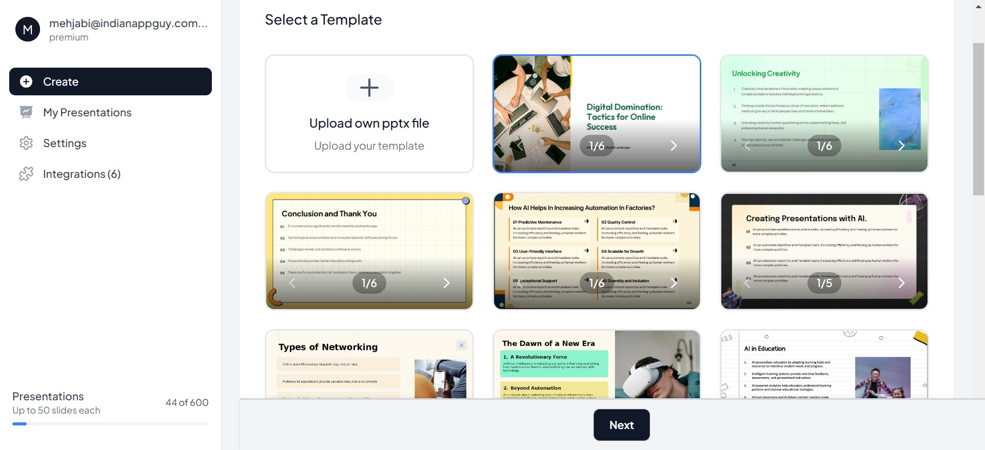
MagicSlides: Your Go-To for Presentation Design Templates
MagicSlides offers a variety of presentation design templates tailored to different styles and needs. Whether you’re presenting data-heavy reports or crafting a visually stunning pitch deck, MagicSlides has you covered. With user-friendly options, you can quickly select a template, customize it, and let your content shine.
Tips for Choosing the Right Template
- Match the Mood: Choose a design that reflects the tone of your presentation. For example, bold and modern for a tech pitch, or soft and approachable for a community project.
- Prioritize Clarity: Templates with clean layouts and ample white space help keep your content easy to follow.
- Consider Your Audience: Tailor your design to resonate with your audience. A formal design works better for corporate settings, while a creative one suits informal presentations.
The Magic of Design in Action
Imagine two presentations:
- One uses inconsistent fonts, mismatched colors, and overcrowded slides.
- The other uses a sleek, professional template with cohesive visuals, clean layouts, and purposeful design.
Which one would you remember? The second, of course. Great design elevates your content, turning an ordinary presentation into an extraordinary one.
Conclusion: Design is the Key to Success
Design is more than just a visual aid—it’s a tool that shapes how your message is received. With the right design, your presentation becomes clear, engaging, and impactful. And with tools like MagicSlides, which offers a wide variety of presentation design templates, creating a stunning presentation has never been easier.
The next time you’re preparing a presentation, remember: content tells the story, but design brings it to life. Choose the right template, refine your slides, and watch your message shine.


