How to Make a Pie Chart on Google Slides in Simple Steps


How to make a pie chart on Google Slides in minutes by following this complete walkthrough. Learn how to create a pie chart on Google Slides via 3 methods.
How to Make a Pie Chart on Google Slides in 5 minutes?
A pie chart in Google Slides is one of the simplest ways to visually represent percentages and proportions to the audience professionally. Here, I’ll explain how to make a pie chart on Google Slides via the appropriate methods step by step, so you can create a clear pie chart without wasting any time on guesswork.
But do you really know when there is a need to add a pie chart in the presentation? If not, then first let me explain the same!
When Should You Use a Pie Chart?
Before creating one, always make sure that adding a pie chart makes sense in your presentation. This means that if the pie chart does not align with your presentation design or content and feels forced, it is best to avoid adding it. I recommend using a pie chart when:
- You are showing complete year or quarter data in a single slide.
- You’ve created slides from a 5 minute presentation topics, so you don’t have much time to explain to your audience what you are trying to explain.
- The data represent percentages or proportional values, which can be difficult to explain to the users via content or theory.
- You are working on a persuasive presentation topics, where you want a visually intuitive comparison.
If you have too many categories or need to show trends, I prefer a bar chart or line chart instead, which looks more professional and is easily understandable to any user.
Still, if you found that there is a need to add a pie chart on Google Slides, then next, I’ll share all the possible and practical methods to do so.
How to Make a Pie Chart on Google Slides?
Step 1: Open Google Slides
Begin by opening Google Slides and creating a new presentation or opening an existing one where you want to insert the pie chart.
Step 2: Insert a Slide
Select the slide where you want to add the pie chart. If you're starting a new presentation, click on the "+" icon or go to "Slide" in the top menu and choose "New Slide."
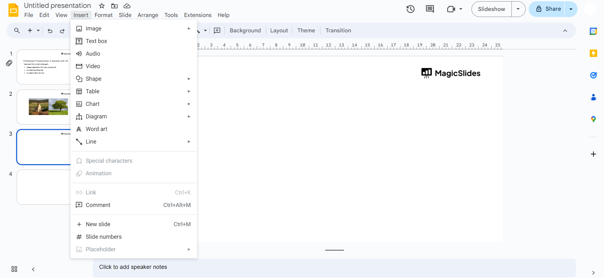
Step 3: Go to the Insert Menu
Click on the "Insert" option in the top menu bar.
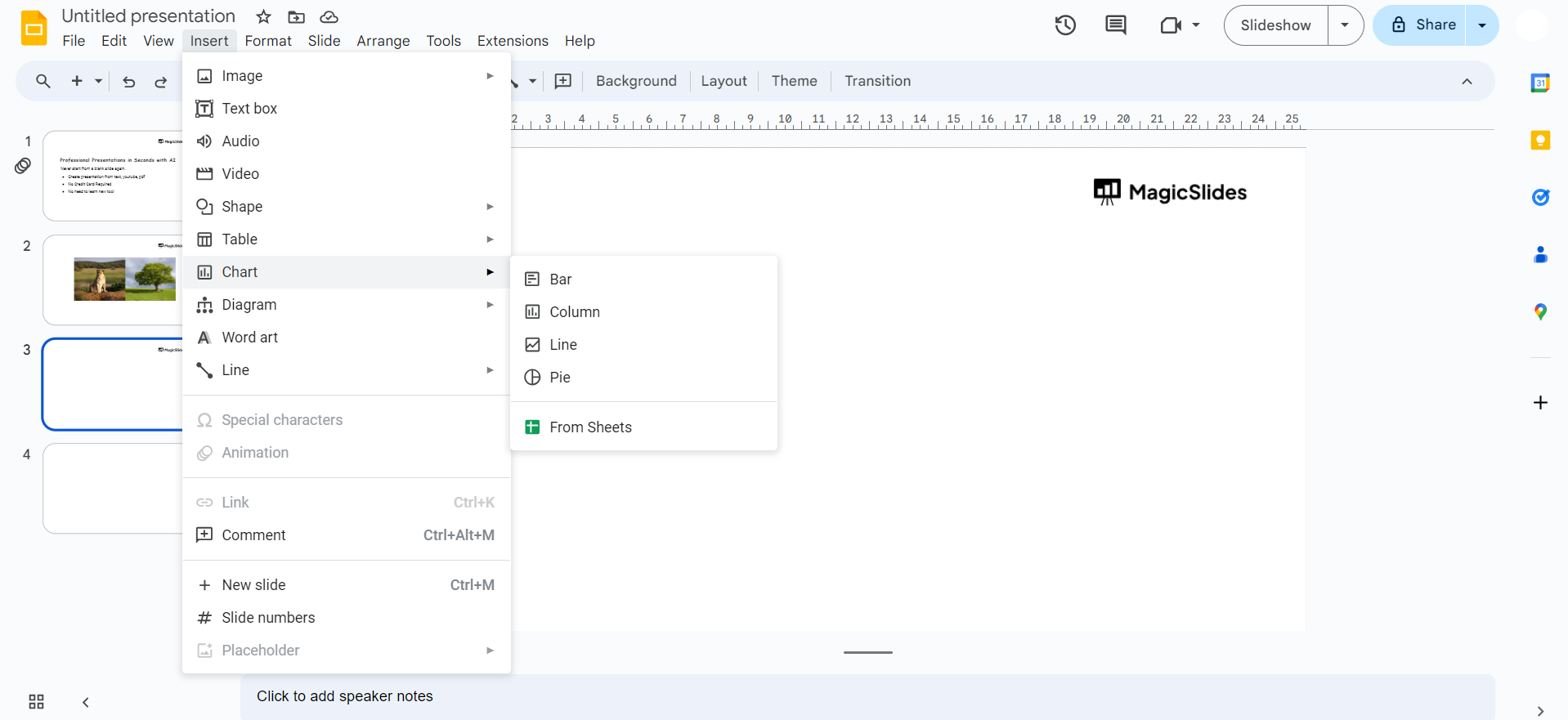
Step 4: Choose Chart
From the drop-down menu, select "Chart" and then choose "Pie Chart" from the chart options.
Step 5: Enter Data
A spreadsheet will appear where you can enter your data once you click on the open source button
Replace the sample data with your own by typing it directly or pasting it from another source.
Step 6: Customize Your Chart
Click on the chart to reveal customization options. Adjust the colors, labels, and other settings to suit your preferences. Google Slides offers various customization features to make your pie chart visually appealing.
Step 7: Resize and Move
Drag the corners or edges of the chart to resize it, and use the click-and-drag method to move it to the desired location on the slide.
Step 8: Finalize and Save
Review your pie chart and make any final adjustments. Once satisfied, save your presentation.
#Method 2. How to Make a Pie Chart on Google Slides Using Google Sheets
If you prefer a precise pie chart quickly, then create one in Google Sheets and then import that into Google Slides. Here’s how:
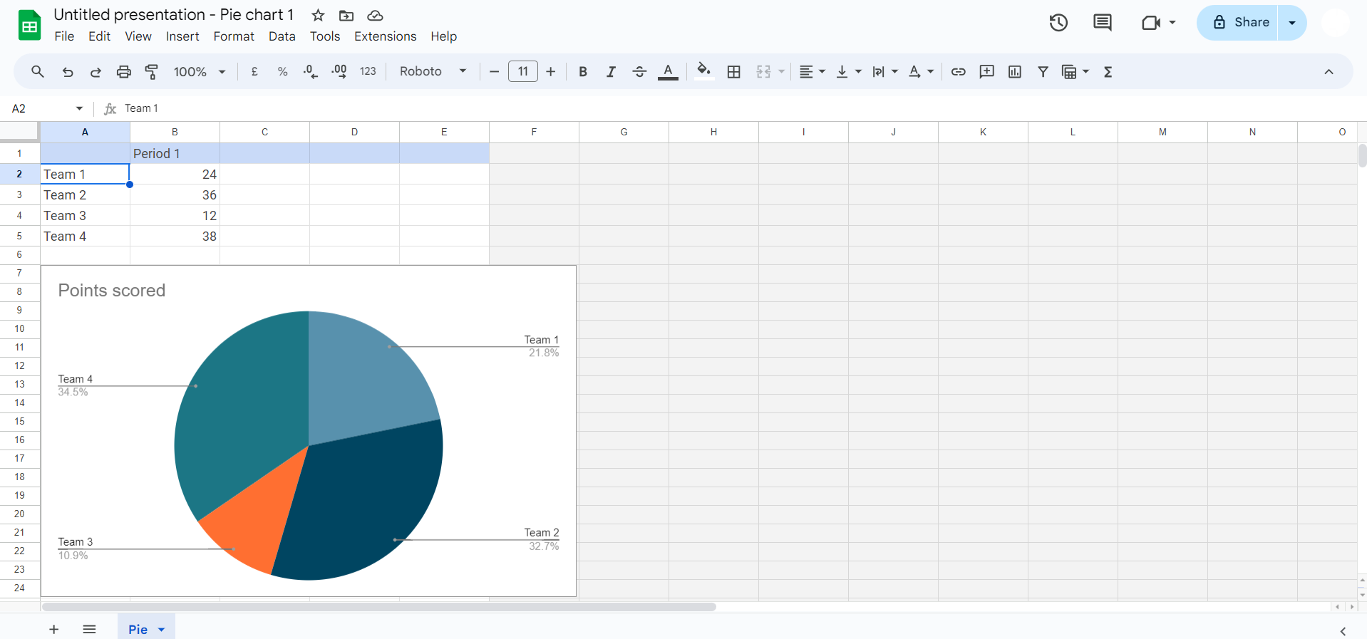
#Step 1. Open Google Sheets
#Step 2. Enter your data in two columns, for example:
| Department | Budget |
| R&D | 50 |
| Operations | 30 |
#Step 3. Now, select the data, then click:
Insert > Chart
Google Sheets automatically suggests a chart. If it is not a pie chart, go to:
Chart type > Pie chart
#Step 4. Customise the pie chart in Sheets:
- Title
- Legend position
- Percentage or value
- Colors
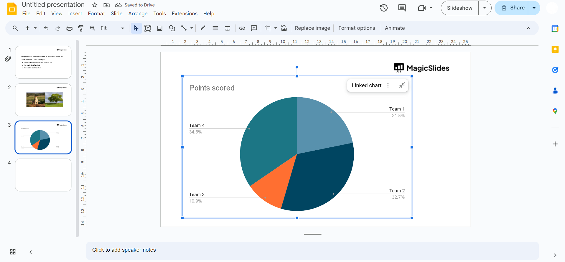
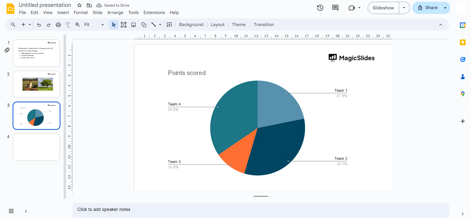
#Step 5. Insert the chart into Google Slides:
Three dots (More options) > Copy chart
Then go to Google Slides and paste it onto your slide.
If your data or charts already exist in a PowerPoint file, you don’t have to recreate everything from scratch; you can first convert it by following this guide on how to convert PPT to Google Slides, and then refine your pie chart directly inside Slides.
#Method 3. How to Create a Pie Chart on Google Slides Automatically?
Sometimes, manually inserting or creating a chart and adjusting data can become time-consuming, especially when you need a quick visualisation for your slide. In situations like this, I prefer using an AI-powered add-on that can build the pie chart for you inside Google Slides.
One such tool that I personally use is MagicSlides AI Presentation Generator. After installing it from the Extensions menu:
- Open it within your presentation.
- Describe what you need. For example, write “Create a slide with a pie chart showing monthly sales distribution,” with the exact figures and percentage.

Instead of asking you to enter data in Sheets or choose chart settings, it processes your request and automatically generates a well-structured pie chart directly on the slide. You don’t need to worry about layout or labels, as it take cares all these things automatically.
The best thing is, for further adjustments, just tell it what exactly you want to change or add, and within seconds it will do the same. Overall, opting for this makes your manual work 2%, as you have to give it just a command, and the rest will do itself.
So, try this now for free, and create desired presentations, with pie charts, visuals, videos, and whatever you want.
How to Make a Pie Chart on Google Slides Hassle-free – Best Practices
However, we now know all the appropriate solutions to add the pie chart to Google Slides. It is mandatory to follow this checklist to get the expected results:
- Limit slices to 6 or fewer, so that your audience can easily understand what your pie chart is saying.
- Ensure every percentage and name is clearly visible.
- Avoid similar colors for different slices.
- Always include a title.
- Keep text large enough to read from a distance.
These simple steps will help you to engage your audience from the start to end of your presentation.
If you want your pie chart and overall slides to look more polished and professional, I strongly recommend checking this guide on how to improve slide design for presentations.
Author’s Verdict
Now, we have proper knowledge on how to make a pie chart on Google Slides with the most preferred methods. Moreover, the combination of Google Slides and Google Sheets makes pie charts both easy to create and easy to maintain. I personally prefer creating charts via MagicSlides AI to get desired results in seconds with just a text.
People Also Ask
Q. Can I create a pie chart without Google Sheets?
Yes. You can insert a chart directly in Google Slides, but it still uses a Google Sheets file in the background.
Q. Can I animate a pie chart in Google Slides?
Yes. You can select the chart and apply an animation from:
Insert > Animation > Appear
However, you cannot animate individual slices separately.
Q. Can I export the pie chart as an image?
Yes. You can right-click the chart and choose Save as image.
Q. Can I make a 3D pie chart?
Google Slides does not support 3D pie charts. If you need a 3D effect, you create it in Google Sheets or PowerPoint first.
Q. Can multiple people edit the chart?
Yes, if they have access to the linked Google Sheets file.


