How to create line chart in Google Slides in few steps


Generate a line chart in Google Sheets, then insert it into Google Slides for dynamic and interactive data visualization.
To create a line chart in Google Slides, you can use Google Sheets to generate the chart and then embed it into your presentation. Here's how to do it:
Step 1: Open or Create a Google Slides Webpage:
- Visit slides.google.com to get started.
Step 2: Input Data:
- In your Google Sheets document, input the data you want to use for the line chart. Ensure you have columns with appropriate labels.
Step 3: Select Data:
- Click and drag to select the data you want to include in your line chart.
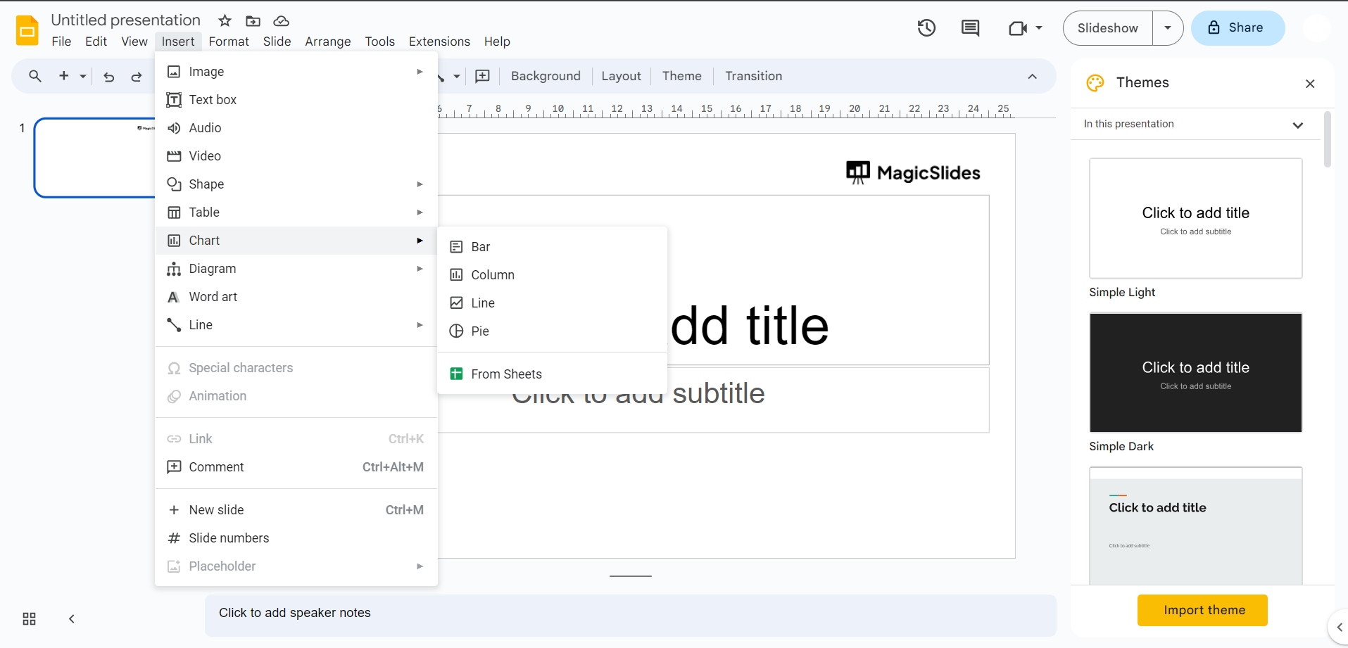
Step 4: Insert Chart:
- After selecting the data, click on the "Insert" menu at the top and choose "Chart."
Step 5: Customize Your Line Chart:
- Customize your chart by adjusting options such as chart title, axis labels, data series colors, and more.

Step 6: Insert into Google Slides:
- Once you're satisfied with the chart's appearance, click the three vertical dots (more options) in the Chart Editor panel.
- Select "Insert chart."
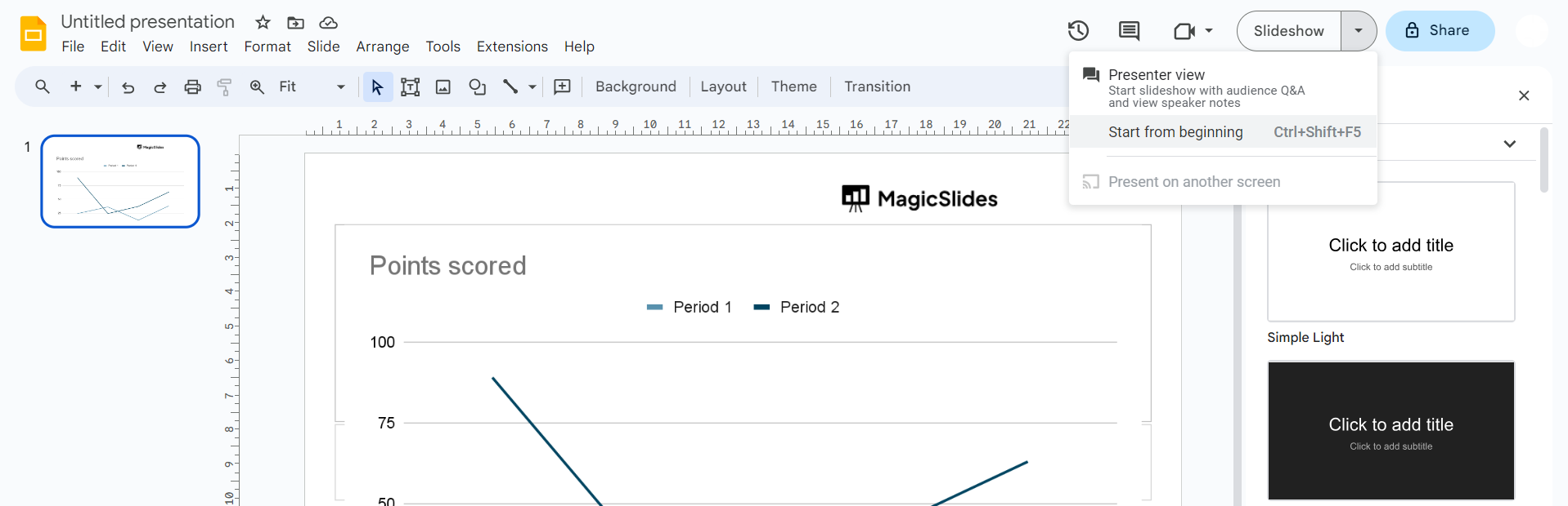
Step 7: Present Your Slide:
- When you present your Google Slides, the line chart will be interactive, and you can click on it to explore the data.
That's how you create and insert a line chart from Google Sheets into your Google Slides presentation. This method allows you to maintain a dynamic connection between your chart and data source.


