How to Add an Average Line in a PowerPoint Chart
Adding an average line to a chart in PowerPoint helps visualize trends and compare data points effectively.
It provides a clear reference for understanding variations within the dataset. Follow this step-by-step guide to insert an average line into your PowerPoint chart.
Step-by-Step Guide to Adding an Average Line in PowerPoint
Step 1: Insert a Chart in PowerPoint
Open your PowerPoint presentation and navigate to the slide where you want to insert the chart.

Click on Insert > Chart from the ribbon. Choose the appropriate chart type (e.g., Line, Column, or Bar Chart) and click OK.
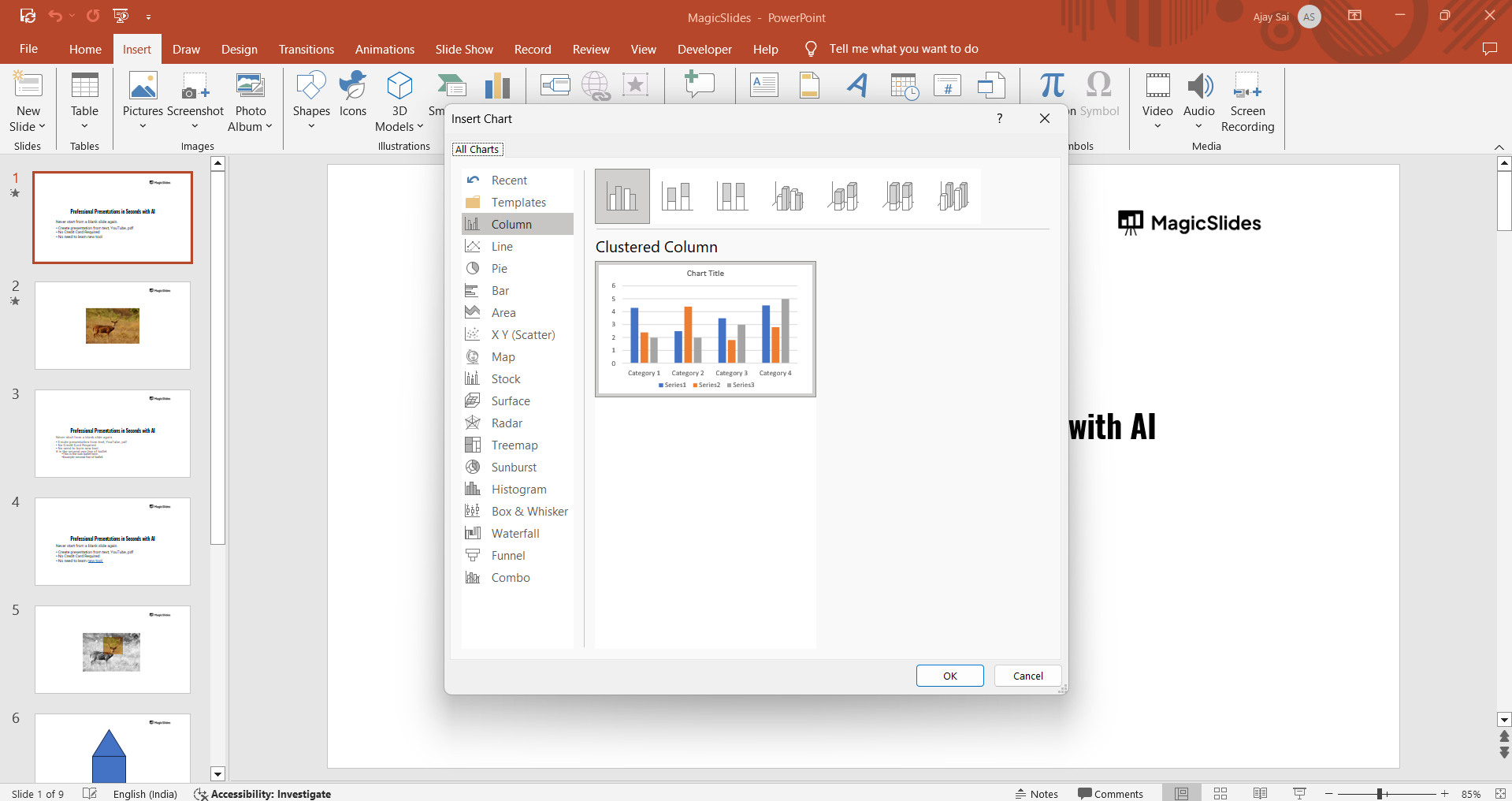
Enter your data in the Excel spreadsheet that appears.
Step 2: Calculate the Average Value
In the Excel sheet linked to your chart, add a new column for the Average Line.
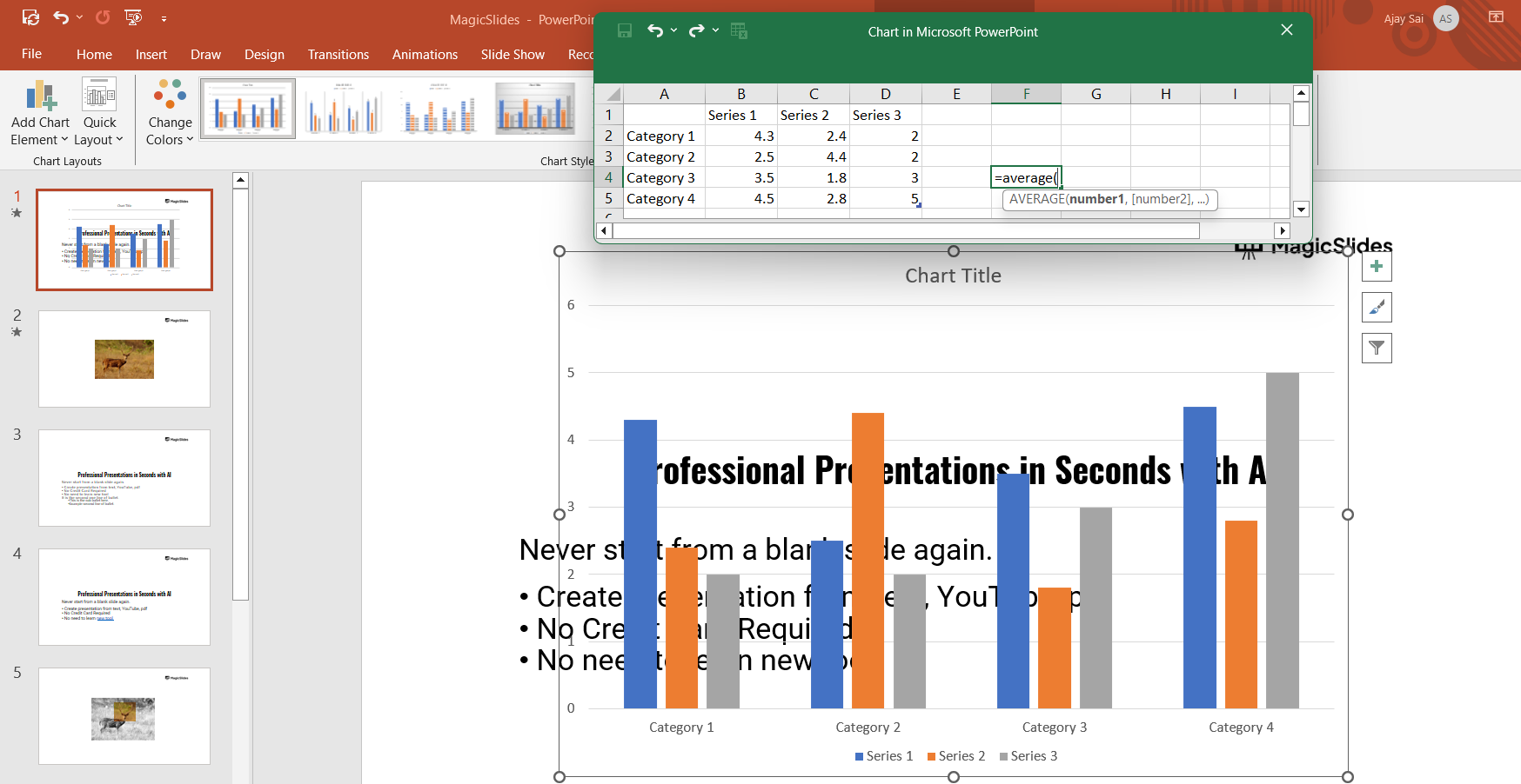
Use the formula =AVERAGE(range) where range includes the data points you want to average.
Drag the formula down so that the same average value appears across all data points.
Step 3: Add the Average Line to the Chart
Click anywhere on the chart to open the Chart Tools menu.
Click on Chart Design > Select Data. In the Select Data Source window, click Add to insert a new data series.
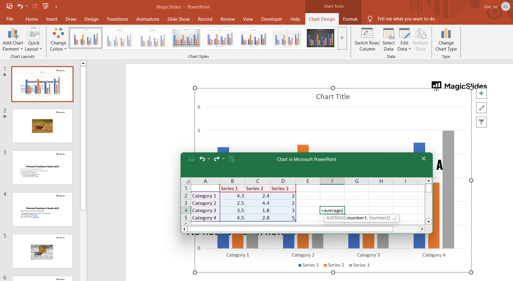
For Series Name, type "Average Line". Select the newly created column (with the average values) as the Series Values and click OK.
Step 4: Change the Average Line Style
Click on the newly added line in the chart. Go to Chart Tools > Format > Shape Outline to customize the appearance.
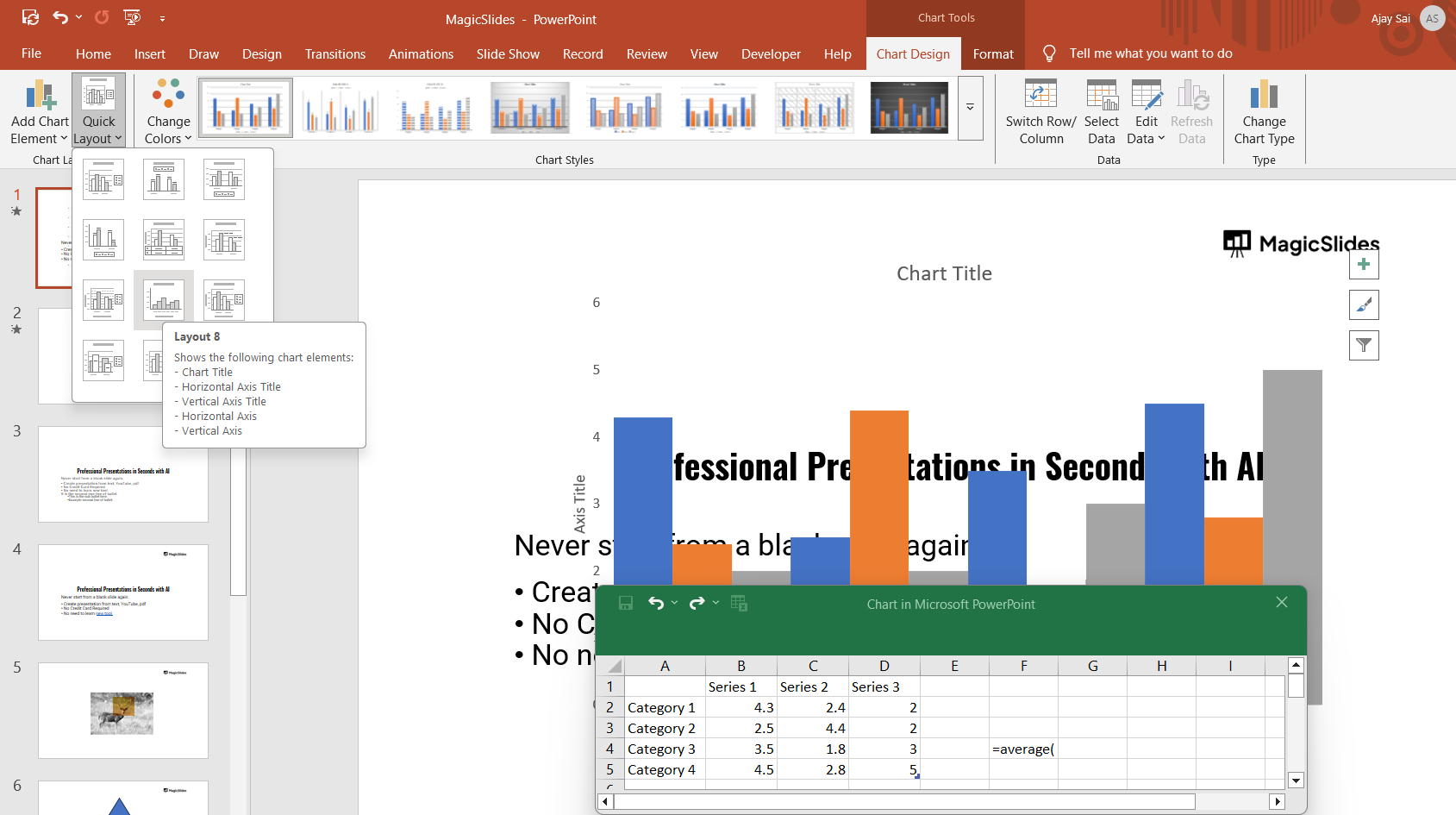
Choose a dashed line or a different color to make it distinguishable from other data points.
Step 5: Adjust Chart Labels and Formatting
Click on Chart Elements (the + button on the top-right of the chart). Enable Legend to clearly display the Average Line label.
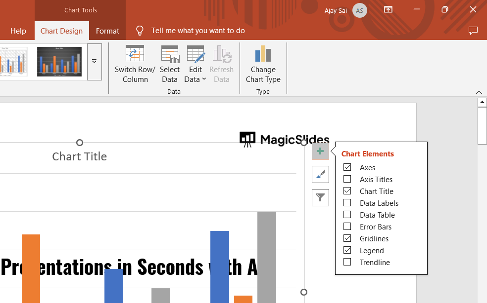
Adjust axis titles, chart title, and gridlines for better readability.
Adding an average line enhances data visualization in PowerPoint. For even faster and smarter presentation creation, check out MagicSlides.app generate AI-powered slides with charts, bullet points, and visuals in just a few clicks!
Conclusion
Adding an average line in PowerPoint charts helps illustrate trends and make data comparisons clearer.
By following these steps, you can enhance your presentation and effectively communicate key insights.
FAQs on Adding an Average Line in PowerPoint
Can I add an average line to a PowerPoint chart without using Excel?
No, PowerPoint requires Excel data integration to compute and display an average line.
What chart types work best with an average line?
Bar, Column, and Line charts best visualize an average line for comparison.
How do I change the style of the average line in PowerPoint?
Click the line, go to Format > Shape Outline, and adjust color, width, or dashes.
Now, your PowerPoint chart is more insightful and visually compelling! 🚀📊
Share on socials
More from the blog
How to Improve Slide Design for Presentations?
6 April 2026
How to Use Google Form Autofill Bot? Step-By-Step Guide
6 April 2026
How to Download Presentation from Gamma App: Easy Ways to Export, Convert & Save Slides
5 April 2026
How to Check Word Count in Google Docs: A Complete Guide
5 April 2026
How to Insert Bitmoji into Google Slides? Complete Guide
3 April 2026
How to Create a Timeline Slide for Presentation with AI
3 April 2026
How to Delete a Photo on Google Slides (6 Simple Ways).
3 April 2026
How to Add Subscript to Text in Google Slides? Explained
3 April 2026
100+ Extempore Topics for Students to Speak Confidently
2 April 2026
