How to Draw Chart in PowerPoint


Easily create and customize charts in PowerPoint to visually present data and enhance your slides
How to Draw a Chart in PowerPoint
Charts are an excellent way to visualize data in a PowerPoint presentation.
Whether you need a bar chart, pie chart, or line graph, PowerPoint makes it easy to create and customize charts directly within your slides.
Follow this step-by-step guide to draw a chart in PowerPoint efficiently.
Step-by-Step Guide to Drawing a Chart in PowerPoint
Step 1: Open PowerPoint and Select a Slide
Launch Microsoft PowerPoint on your computer. Open an existing presentation or create a new one.
Navigate to the slide where you want to insert the chart.
Step 2: Insert a Chart
Click on the Insert tab in the top ribbon. Select Chart from the Illustrations group.
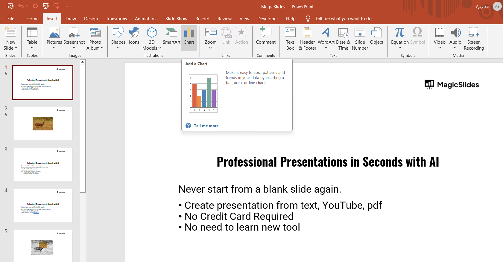
A dialog box will appear with various chart types.
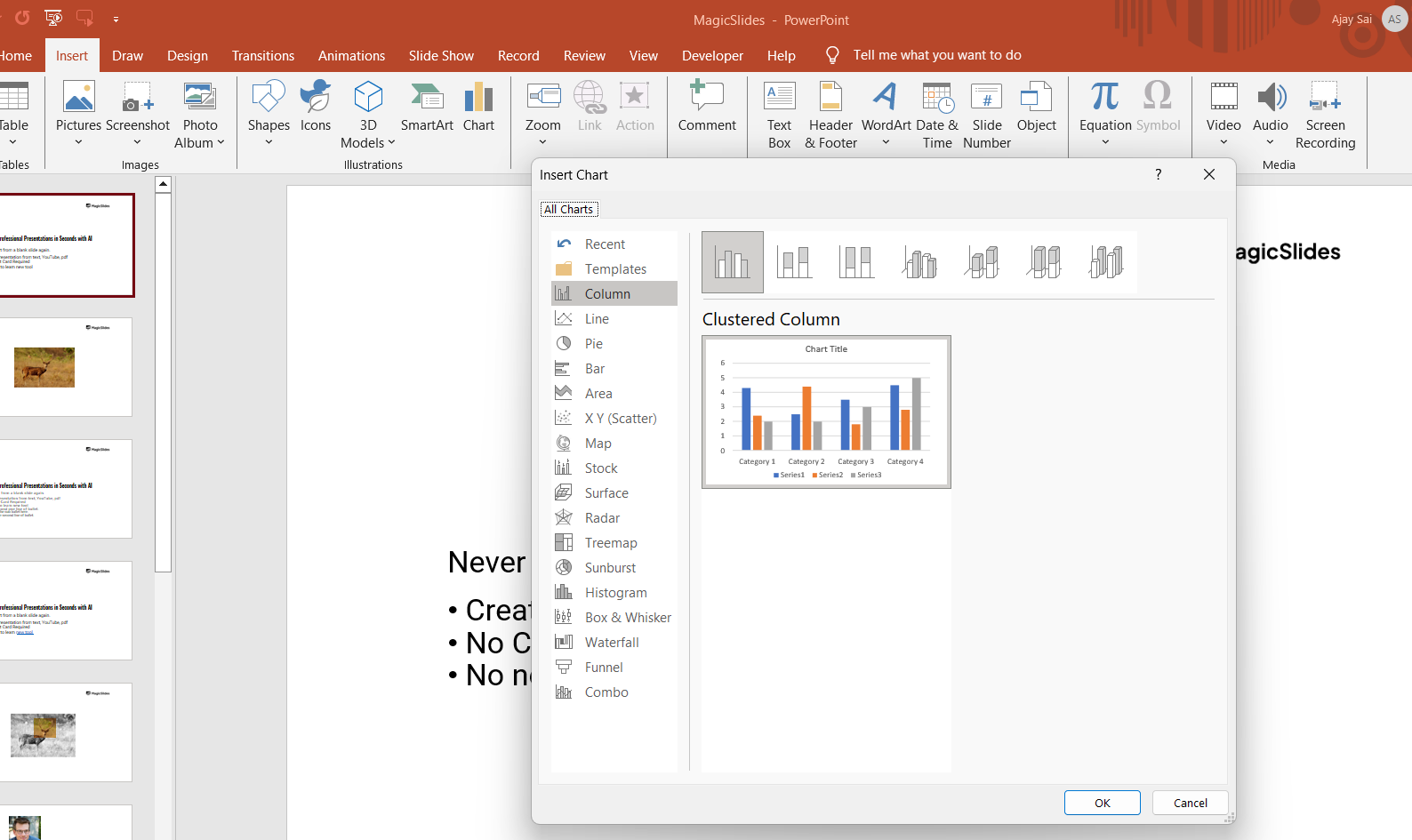
Step 3: Choose a Chart Type
Browse through the available chart options, such as:
- Column Chart
- Bar Chart
- Line Chart
- Pie Chart
- Scatter Plot
Select your preferred chart type and click OK.
Step 4: Edit Chart Data in Excel
A small Excel window will open, displaying a sample data table. Replace the sample data with your own values.
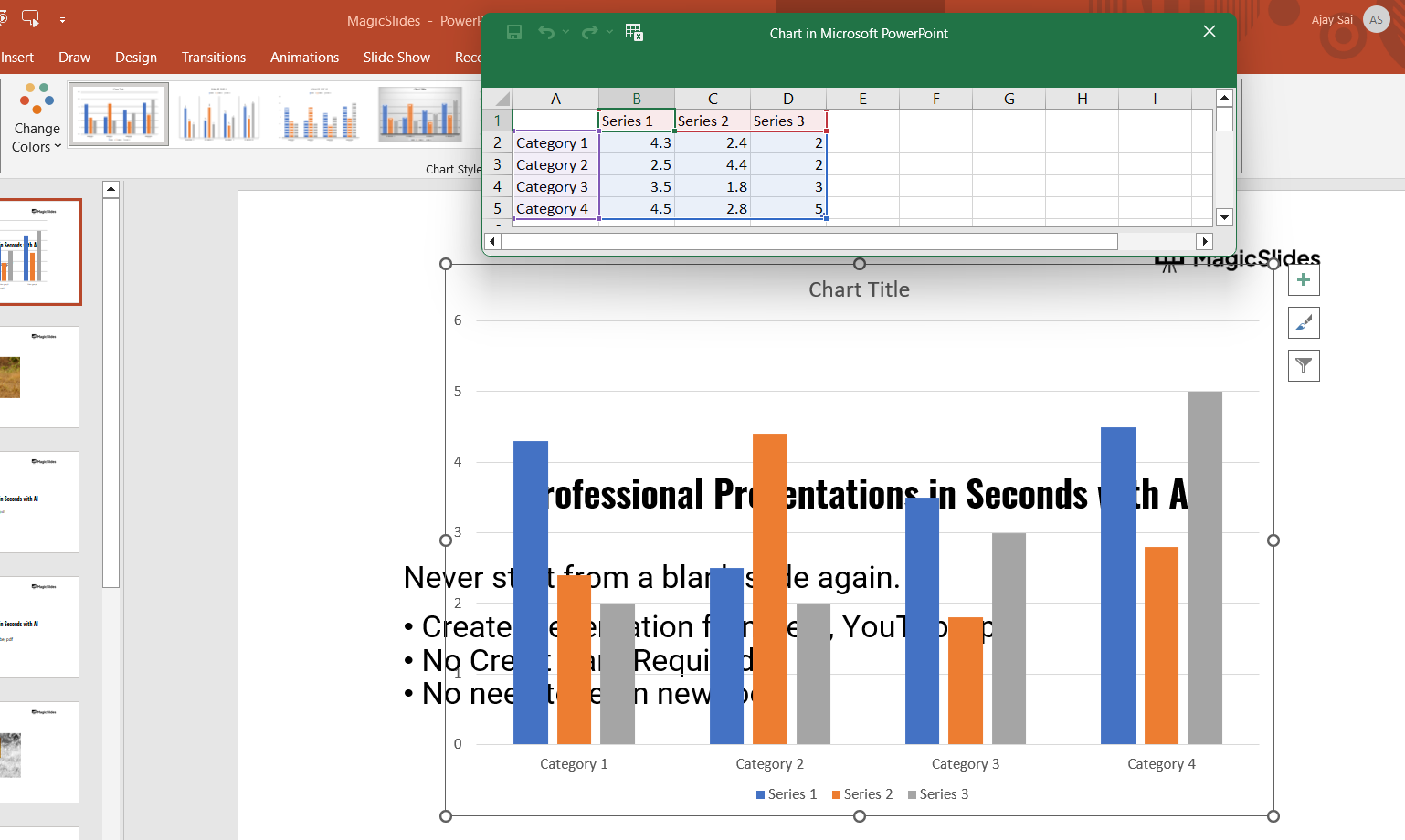
Modify column and row names as needed to reflect your dataset. Close the Excel window to save the changes.
Step 5: Customize the Chart
Click on the chart to open the Chart Tools tab.
Use the Chart Design and Format options to:
- Change colors and styles
- Add or remove labels
- Adjust chart elements (title, axes, gridlines)
Click on Chart Elements (+ icon) to enable or disable specific features like legends and data labels.
Step 6: Resize and Position the Chart
Click on the chart to select it. Drag the corners to resize it as needed.
Move the chart to your desired location on the slide.
Step 7: Save Your PowerPoint Presentation
Once satisfied with your chart, save the PowerPoint file. Click File > Save As, choose a location, and save your presentation.
Creating charts in PowerPoint helps visualize data effectively. Want an easier way? MagicSlides.app can generate AI-powered presentations, including data-driven slides, in seconds!
Conclusion
Creating a chart in PowerPoint is a simple and effective way to present data visually.
By following these steps, you can insert, edit, and customize a chart to make your presentation more engaging and informative.
FAQs are here to guide!
Can I update the chart data later?
Yes! Simply click on the chart, go to Chart Design > Edit Data, and update the values in the Excel sheet.
How do I change the chart type after inserting it?
Select the chart, go to Chart Design > Change Chart Type, and pick a new format.
Can I add animations to my chart?
Yes! Click on the chart, go to the Animations tab, and choose an animation effect to highlight different parts of your chart.


