Create Bargraph Presentation Slide with AI
Bargraph Slide with a single click. Enter slide description, we will generate PPT for you for free. Click the bulb for topic ideas.

Magic Slides · Senior Designer · will design your presentation
13.6k PPTs created in the last 30 days
Magic Slides will generate a single bar graph slide. Want a full deck? Just say so.
Bar graph slide templates

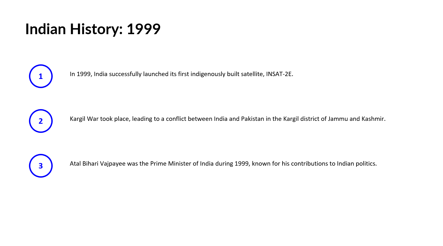
bargraph1
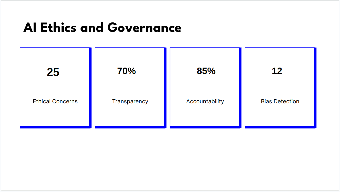
bargraph2
Create Slide with AI


Ask AI about MagicSlides


