How To Add Charts in Google Sheets?


Learn step-by-step how to effortlessly add visually appealing charts in Google Sheets with our easy-to-follow guide. Enhance your data presentation!
Google Sheets, a robust cloud-based spreadsheet tool, offers a myriad of features to streamline data management and presentation. Among its powerful capabilities is the ability to create dynamic and visually appealing charts. In this guide, we will walk you through the step-by-step process of adding a chart to your Google Sheets, transforming your raw data into a visual masterpiece.
How To Add Charts in Google Sheets
Step 1: Open Google Sheets
Begin by opening Google Sheets. If you don't have an account, sign up for free and access Google's suite of productivity tools.
Step 2: Open the Desired Sheet
Navigate to the sheet where your data resides. If you're starting from scratch, create a new sheet and input your data.
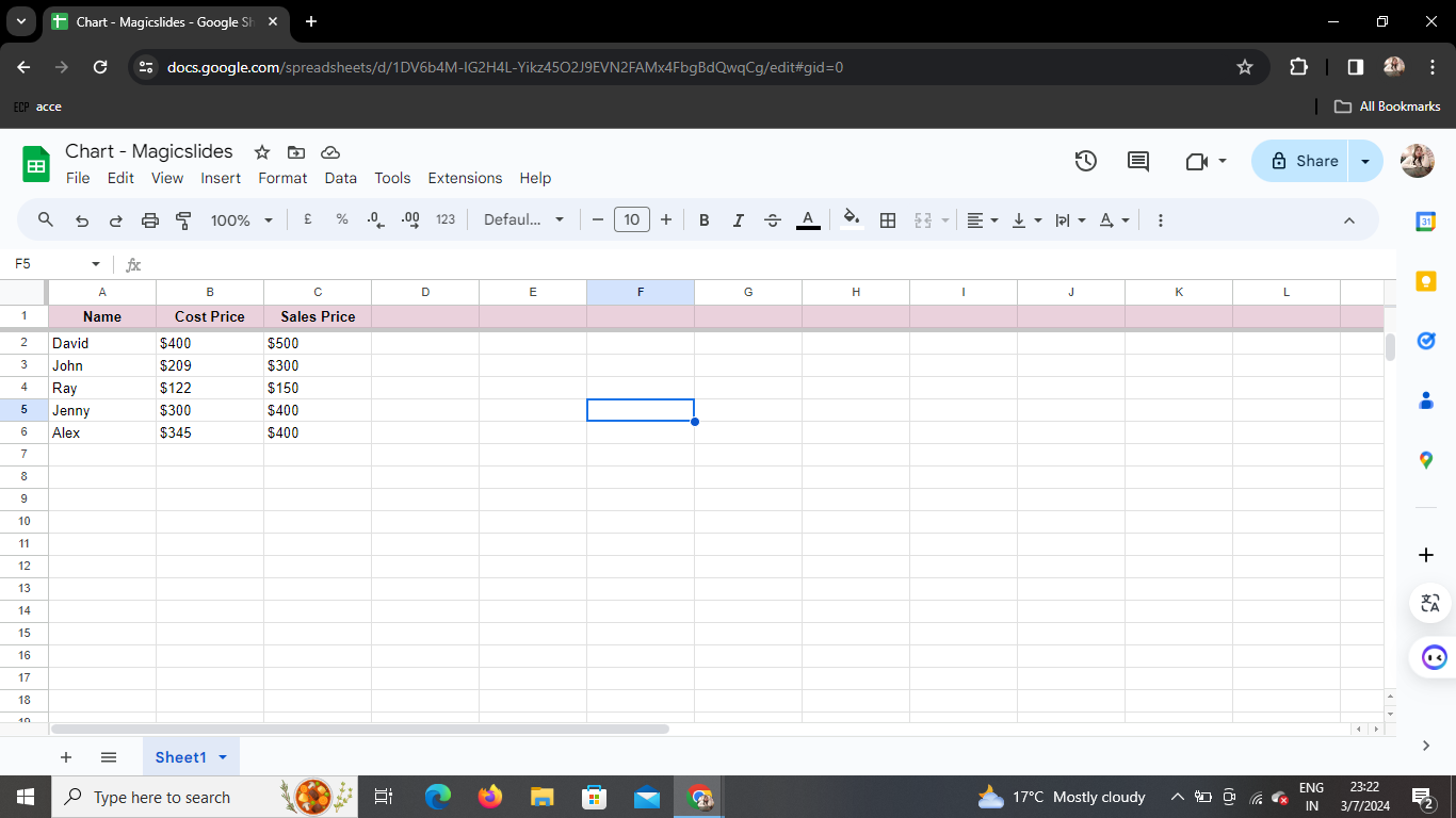
Step 3: Select the Range and Data
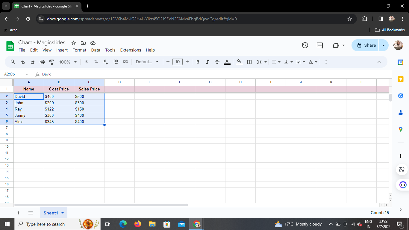
Highlight the range of cells containing the data you want to visualize. This could be numerical or categorical data relevant to your analysis.
Step 4: Click on Insert > Chart
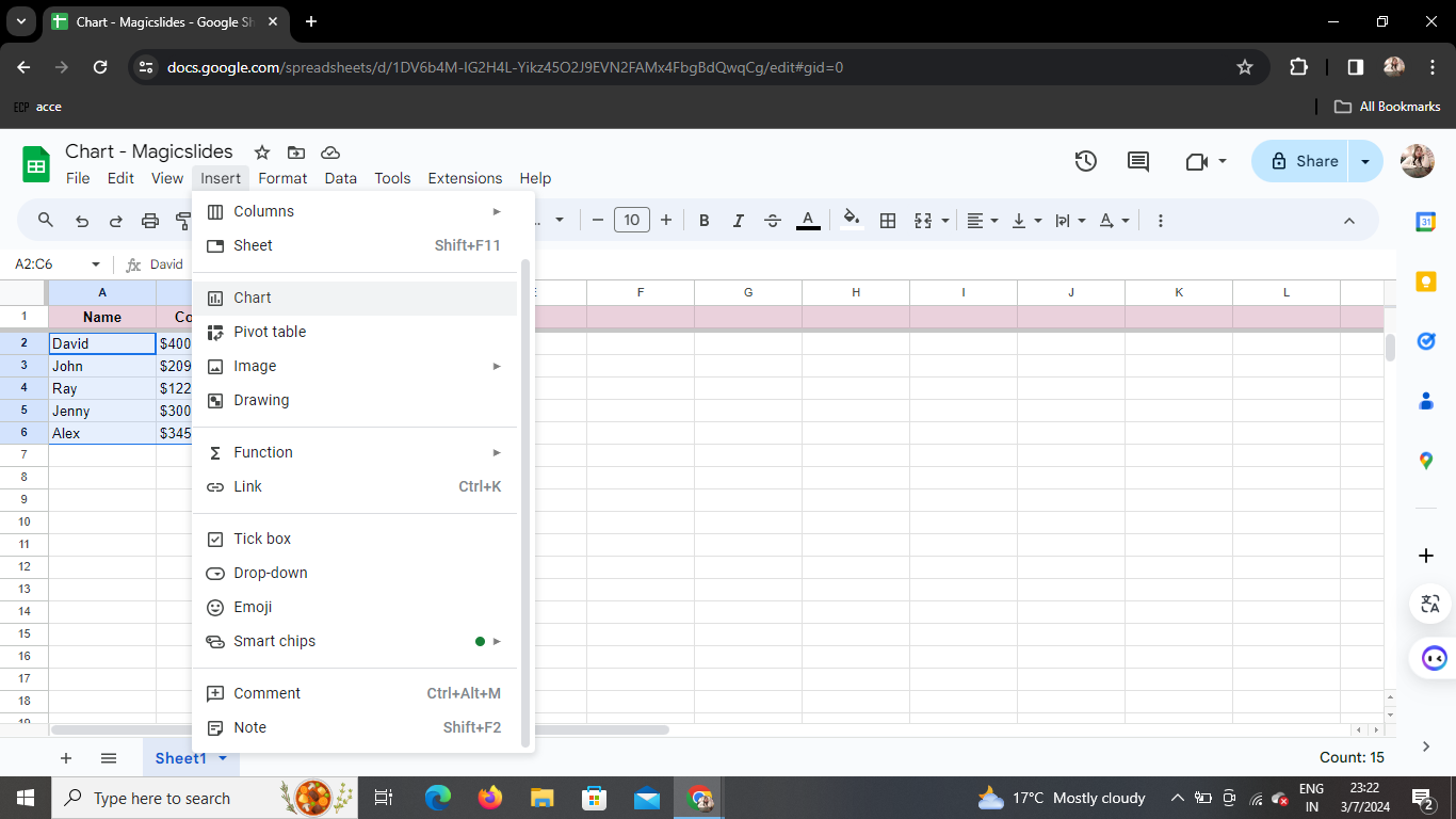
In the top menu, click on "Insert" and select "Chart" from the dropdown menu. This action opens a new window dedicated to customizing your chart.
Step 5: Customize the Desired Data
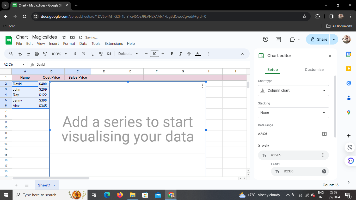
A dropbox appears, allowing you to fine-tune your chart settings. Customize elements such as chart title, axis labels, and data range based on your preferences.
Step 6: Choose Chart Type
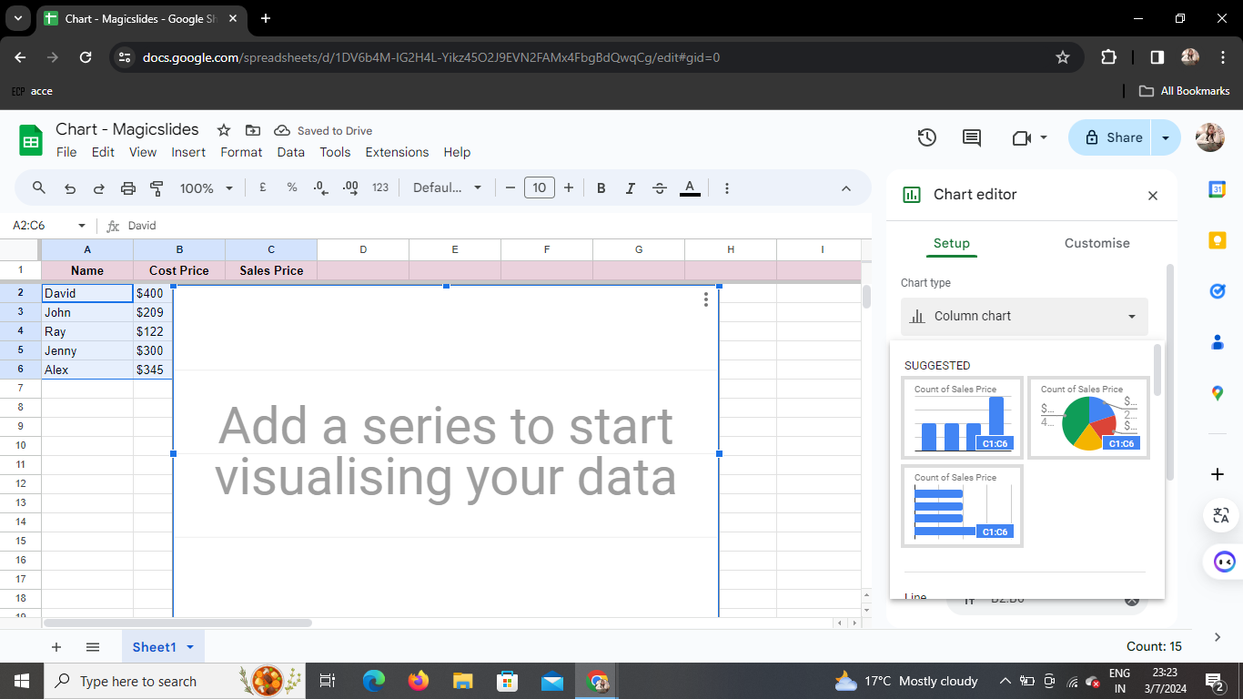
Navigate to the "Chart Type" dropdown menu and choose the type of chart that best represents your data. Options include bar, line, pie, and more. Experiment to find the most suitable visualization.
Step 7: Your Chart is Ready!
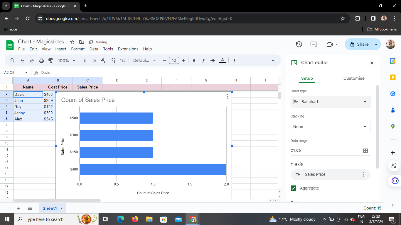
With a few clicks, your chart is now seamlessly integrated into your Google Sheet. Drag it to the desired location for optimal visibility.
Conclusion
Creating charts in Google Sheets is a straightforward process that empowers you to communicate data insights effectively. Whether you're presenting to colleagues, clients, or students, visualizations add a layer of clarity to your information.
Frequently Asked Questions (FAQs)
How can I edit my chart after creating it? After creating your chart, click on it, and an "Edit Chart" button will appear. Clicking this allows you to modify your chart's settings.
Can I add multiple charts to a single sheet? Absolutely! Repeat the process for each set of data you want to visualize, and Google Sheets will seamlessly incorporate multiple charts on the same sheet.
Is there a limit to the types of charts I can create? Google Sheets offers a diverse range of chart types, ensuring you find the perfect representation for your data. From pie charts to scatter plots, the possibilities are vast.
Can I export my Google Sheets chart to other applications? Yes, charts can be easily exported as images or linked to other Google applications, enhancing the versatility of your visualizations.
Is it possible to collaborate on a Google Sheets chart in real-time? Certainly! Google Sheets' collaborative features enable simultaneous editing, making it an ideal platform for teamwork on data visualization projects.


