How to make a graph in PowerPoint


Elevate your presentations with compelling visuals! Learn how to create graphs in PowerPoint effortlessly
Graphs are essential visual aids for presenting data effectively in PowerPoint presentations. Whether you're showcasing sales figures, survey results, or trends over time, creating a graph can enhance your message and engage your audience. In this guide, we'll walk you through the step-by-step process of making a graph in PowerPoint.
How to make a graph in PowerPoint
Step 1: Open PowerPoint
Launch Microsoft PowerPoint on your computer to begin the process of making a graph.
Step 2: Insert a Slide
Create a new slide or navigate to the slide where you want to insert the graph.
Step 3: Click on "Insert"
In the PowerPoint toolbar, click on the "Insert" tab located at the top of the screen.
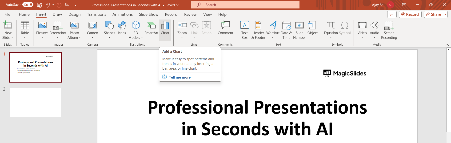
Step 4: Select "Chart"
Within the Insert tab, locate and click on the "Chart" option.
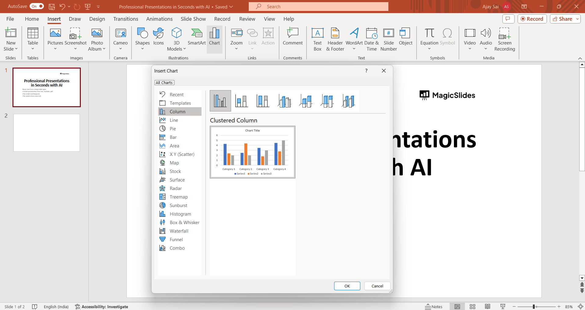
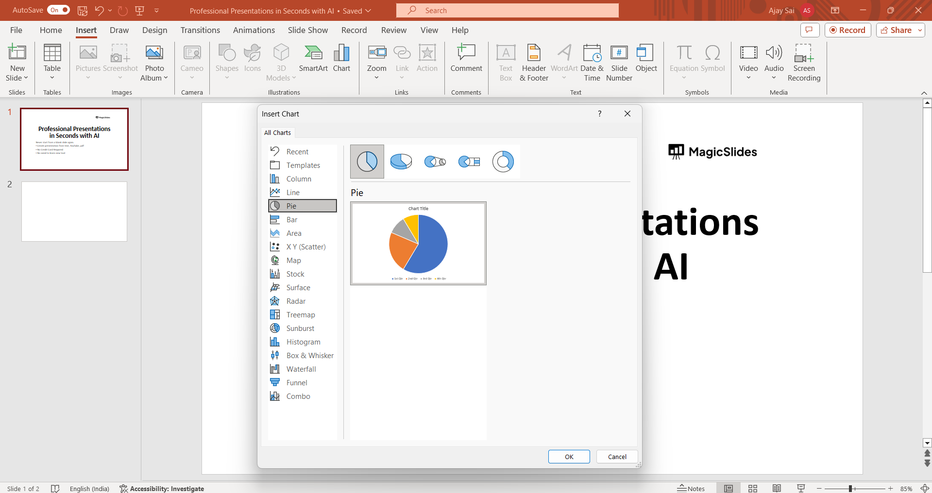
Step 5: Choose a Chart Type
A dialog box will appear with various chart types such as bar, line, pie, etc. Select the type of chart that best suits your data.
Step 6: Enter Data
A spreadsheet will appear within PowerPoint where you can enter your data. Replace the sample data with your own by typing directly into the cells.
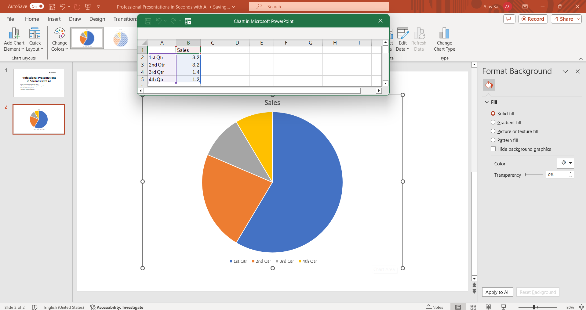
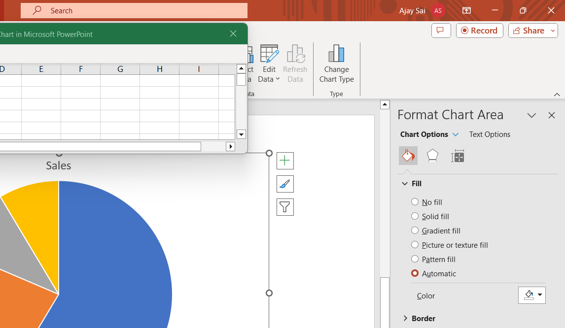
Step 7: Customize Your Graph
Once you've entered your data, you can customize the appearance of your graph by changing colors, fonts, labels, and other formatting options.
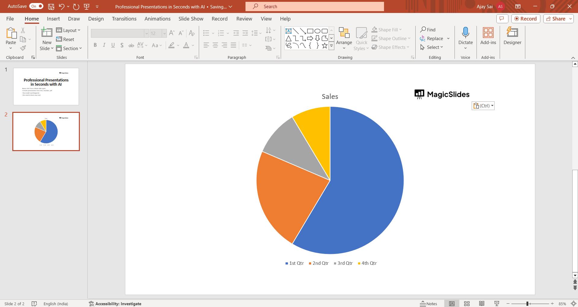
Step 8: Insert the Graph
After customizing your graph, click on the "OK" or "Insert" button (depending on your version of PowerPoint) to insert the graph onto your slide.
Conclusion:
Adding a graph to your PowerPoint presentation is an effective way to visually represent data and make your message more compelling. By following the simple steps outlined in this guide, you can easily create professional-looking graphs that enhance the clarity and impact of your presentations. Whether you're a business professional, educator, or student, mastering the art of graph creation in PowerPoint will undoubtedly elevate your presentations to the next level.
Frequently Asked Questions:
What types of graphs can I create in PowerPoint?
PowerPoint offers various chart types, including bar, line, pie, and scatter plots, to visualize data effectively.
Can I edit the data in my graph after inserting it into PowerPoint?
Yes, you can easily edit the data in your graph by selecting the chart and updating the linked Excel spreadsheet.
How can I ensure my graph fits seamlessly into my PowerPoint design?
You can customize the appearance of your graph by adjusting colors, fonts, and styles to match your presentation's theme.
Is it possible to animate my graph to enhance my presentation?
Yes, PowerPoint allows you to animate your graph elements to add dynamic visual effects and engage your audience.


