How to add a column chart in Google Slides


Enhance your Google Slides prowess by effortlessly adding impactful column charts with this step-by-step tutorial.
Creating a compelling presentation involves more than just words; visuals play a crucial role. In this tutorial, we'll walk you through the process of adding a column chart to your Google Slides presentation, turning your data into a visually engaging story.
How to add a column chart in Google Slides
Step 1: Open Google Slides
Log in to your Google account and open Google Slides. If you don't have an existing presentation, create a new one.
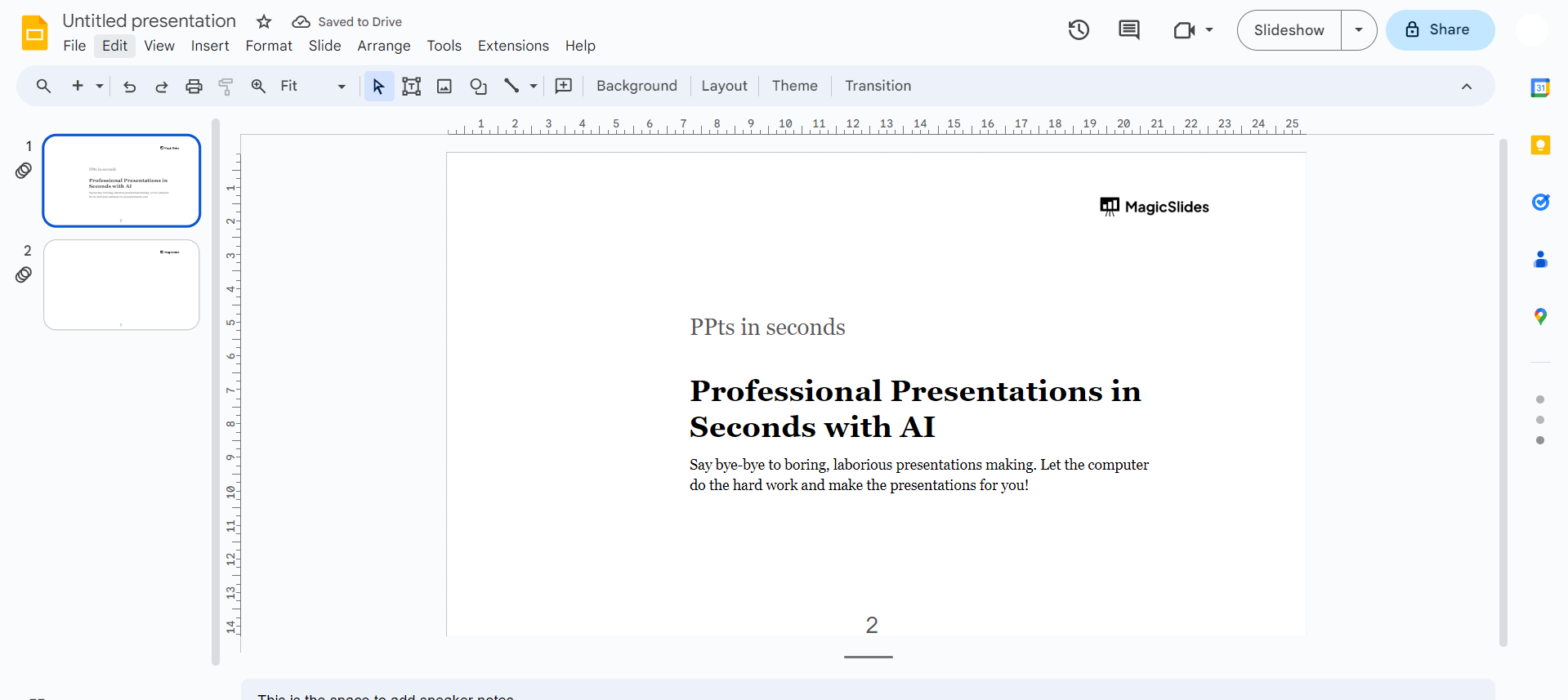
Step 2: Select or Create a Slide
Choose the slide where you want to add the column chart. Click on it to make sure you're working on the correct slide.
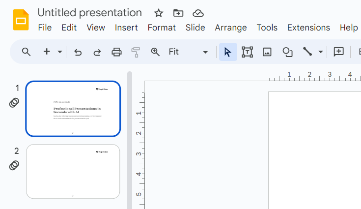
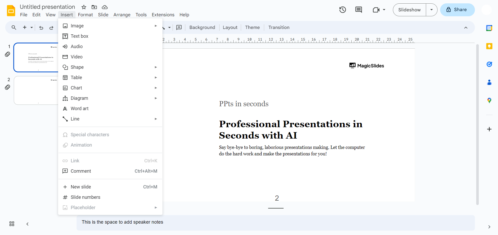
Step 3: Access the Insert Menu
Navigate to the top menu and click on "Insert." A drop-down menu will appear with various options.
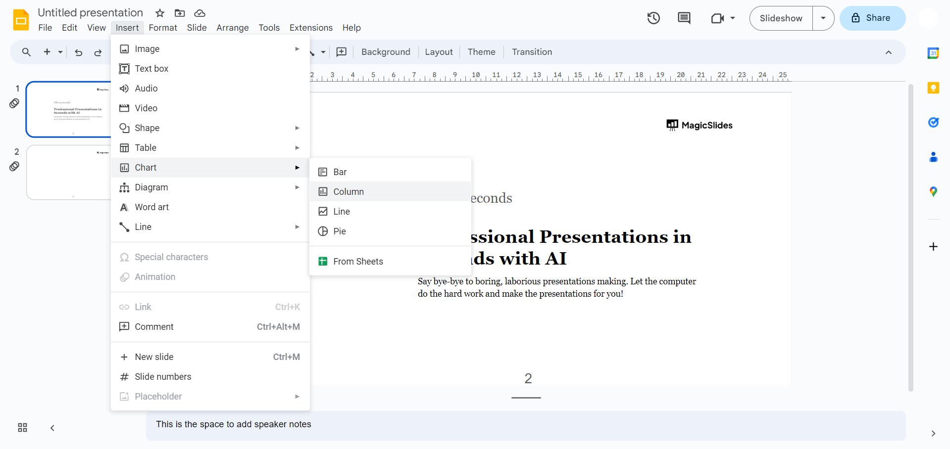
Step 4: Choose Chart
From the "Insert" menu, select "Chart." This will open a window with different chart options.
Step 5: Select Column Chart
In the Chart window, click on the "Chart type" drop-down menu. Choose "Column" from the various chart types available.
Step 6: Input Your Data
A spreadsheet will appear where you can input your data. Replace the sample data with your own, ensuring accuracy for a meaningful representation.
Step 7: Customize Chart Style
Explore the customization options on the right side of the Chart window. Adjust colors, fonts, and other style elements to match your presentation theme.
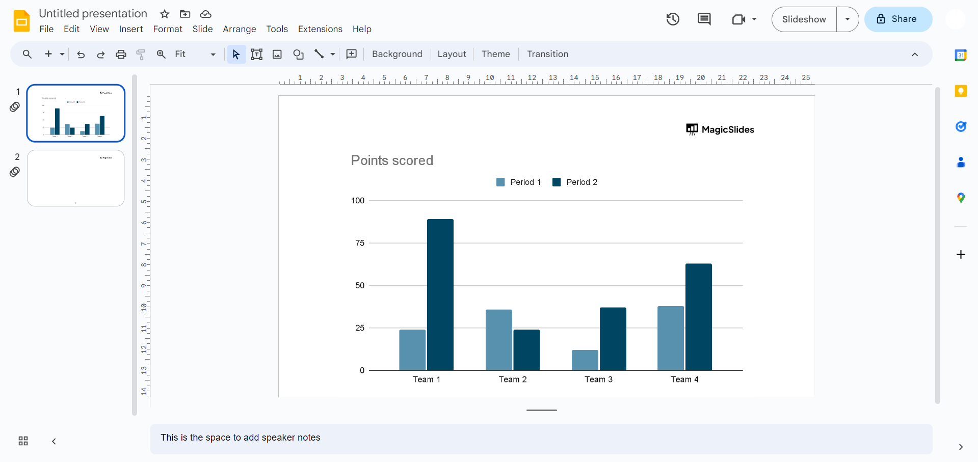
Step 8: Save and Share
Don't forget to save your presentation, and when you're ready, share it confidently with your audience.
Conclusion:
You've successfully added a dynamic column chart to your Google Slides presentation. Elevate your data storytelling and captivate your audience with visually appealing charts. For more tips and tricks on effective presentations, explore our blog for a wealth of resources!
Frequently Asked Questions:
1. Why choose a column chart for my Google Slides presentation?
Answer: Column charts visually represent data trends, making complex information easy to understand and engaging.
2. Can I customize the appearance of the column chart to match my presentation's theme?
Answer: Absolutely! Google Slides provides customization options, allowing you to tailor the chart to your presentation's aesthetic.
3. Is it possible to edit the data in the column chart after inserting it into my slide?
Answer: Yes, you can easily update your data. Click on the chart, then the "Edit" button.
4. How can I animate the column chart or explore advanced features in Google Slides?
Answer: Explore Google Slides' advanced features, including animations, real-time data linking, to add extra dynamism.
Check out these info blogs by us:
- How To Use Microsoft Dictate In Desktop PowerPoint: https://www.magicslides.app/blog/how-to-use-microsoft-dictate-in-desktop-powerpoint
- How To Rename A Slack Channel On Desktop: https://www.magicslides.app/blog/how-to-rename-a-slack-channel-on-desktop
- How To Change Layout Of A Powerpoint Presentation: https://www.magicslides.app/blog/how-to-change-layout-of-a-powerpoint-presentation
- How To Reset A Presentation In Powerpoint: https://www.magicslides.app/blog/how-to-reset-a-presentation-in-powerpoint


