How to Choose the Right Fonts for Your Presentation


Learn how to choose the perfect fonts for your presentation. Boost readability, professionalism, and impact effortlessly with expert tips and MagicSlides.
A well-crafted presentation is like a story waiting to be told, and every element from visuals to text plays a crucial role in delivering your message. Fonts, often underestimated, are one of those elements. The right font can amplify your message, make your slides visually appealing, and even establish your credibility. On the other hand, a poorly chosen font can distract your audience or dilute your message.
In this blog post, we’ll guide you through the process of selecting the perfect fonts for your presentation. Whether you’re preparing a business pitch, an academic lecture, or a creative proposal, these tips will help you stand out and ensure your message is heard loud and clear.
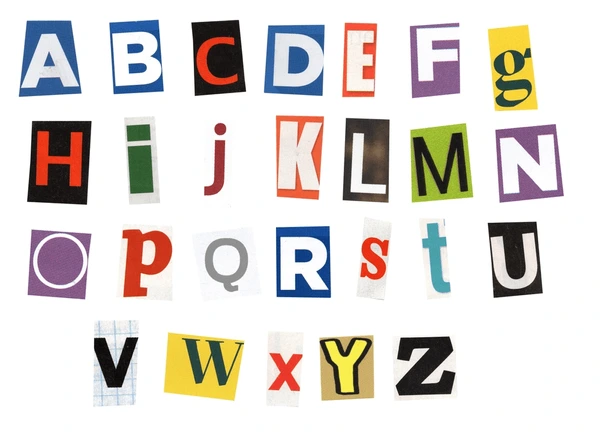
Why Fonts Matter in Presentations
Fonts do more than just display your text—they communicate tone, emotion, and professionalism.
For instance:
- Professionalism: Clean, easy-to-read fonts like Arial or Helvetica convey professionalism and are perfect for corporate presentations.
- Creativity: Artistic fonts can showcase creativity but need to be used sparingly to avoid overwhelming the audience.
- Emotion: Serif fonts like Times New Roman can evoke tradition and formality, while sans-serif fonts like Calibri feel modern and approachable.
By understanding the subtle impact of fonts, you can align your presentation’s tone with its purpose.
Tips for Choosing the Right Fonts
1. Prioritize Readability
Your audience should never struggle to read your slides. Always choose fonts that are clear and legible from a distance. Sans-serif fonts, such as Calibri, Arial, or Helvetica, are excellent choices because they’re clean and modern.
When using MagicSlides, for example, its AI-driven design ensures that fonts are optimized for readability, so you can focus on your content rather than typography details.
2. Match the Font to Your Brand
Consistency with your brand identity is essential. For corporate presentations, use fonts that align with your company’s branding guidelines. For creative fields, experiment with stylish fonts but keep them consistent with your overall design.
MagicSlides helps you maintain brand consistency effortlessly, offering pre-designed templates with fonts tailored for various industries.
3. Stick to Two Fonts
A good rule of thumb is to use two complementary fonts—one for headings and one for body text. This creates visual hierarchy and keeps your slides organized. For example:
- Use a bold font like Montserrat for titles.
- Pair it with a simple font like Roboto for the body text.
4. Consider the Context
The context of your presentation influences your font choices:
- Formal settings: Use professional fonts like Georgia or Garamond.
- Casual settings: Opt for relaxed fonts like Open Sans or Verdana.
- Creative presentations: Try modern fonts like Lato or Futura, but avoid overly decorative styles.
MagicSlides offers smart recommendations based on the context of your presentation, making it easy to align your font style with your goals.
5. Mind the Font Size
Your slides should be easy to read from the back of a room. For presentations, aim for:
- Titles: 36–44 points
- Subheadings: 28–36 points
- Body text: 24–28 points
MagicSlides optimizes font sizes for you, ensuring your text looks professional and is audience-friendly.
6. Avoid Common Font Pitfalls
Some fonts are best avoided in presentations:
- Too decorative: Fonts like Comic Sans or Papyrus can appear unprofessional.
- Too thin or condensed: These fonts can be hard to read, especially on a projector.
- Too similar: Avoid using fonts that lack contrast, as it makes the text blend together.
Leveraging MagicSlides for Perfect Font Selection
MagicSlides is a game-changer when it comes to creating stunning presentations. Its intelligent design engine not only helps you choose fonts but ensures they align with your content, theme, and audience. Whether you’re working on a corporate pitch or a creative portfolio, MagicSlides takes the guesswork out of font selection and provides you with professionally designed slides in minutes.
Some key font-related features of MagicSlides include:
- AI-driven font recommendations: Tailored suggestions based on your presentation’s tone and purpose.
- Pre-designed templates: Professionally crafted designs with cohesive font combinations.
- Custom branding: Easily match fonts to your company’s brand identity.
By using MagicSlides, you can save time and focus on delivering a compelling presentation instead of worrying about design details.
Final Thoughts
Choosing the right fonts for your presentation is a vital step in crafting an impactful message. By focusing on readability, context, and consistency, you can create slides that not only look great but also communicate effectively. Remember, the fonts you choose reflect your professionalism and attention to detail.
If you’re looking for a tool to simplify this process, consider using MagicSlides. With its AI-powered design features, you can ensure your presentation is visually stunning, polished, and tailored to your audience’s needs.
Elevate your presentations today—let MagicSlides do the heavy lifting so you can shine on stage!


