How to Create a Graph Presentation with AI


Learn to create detailed, engaging graph presentations quickly with AI, enhancing data visualization and audience engagement.
Presenting complicated information in an understandable and visually appealing manner is essential in today's data-driven environment.
Graphs can transform abstract numbers into clear trends and patterns that tell a story. With MagicSlides.app, creating a detailed and attractive graph presentation is easier than ever, thanks to its AI-powered features.
Let’s walk through how you can use this innovative tool to craft a graph presentation that not only looks great but also conveys your data compellingly.
Why Use Graphs in Your Presentations?
Simplifying Complex Data
Graphs are essential for breaking down complex data into understandable visuals. Whether you’re showing sales trends, customer demographics, or performance metrics, graphs allow your audience to quickly grasp the significance of the data without getting bogged down by numbers.
Enhancing Engagement
A visual representation of data is much more likely to capture and hold your audience’s attention than raw data or text-heavy slides. Well-designed graphs can make your presentation more interactive and dynamic.
Creating Your Graph Slide with MagicSlides.app
Step 1: Visit MagicSlides.app
Begin by opening your web browser and going to MagicSlides.app. This platform offers a suite of tools designed to make your presentations more professional and engaging.

Step 2: Engage with Slide with AI
On the homepage, find and click on the “Slide with AI” option. This feature uses artificial intelligence to help create slides tailored to your specific presentation needs.

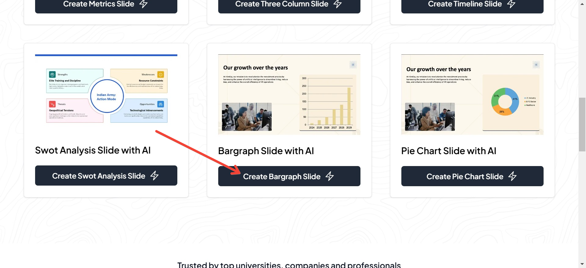
Step 3: Select the Bar Graph Slide
Scroll through the available options under “Slide with AI” until you find the “Bar Graph Slide.” Click on it to start the process of creating your graph.
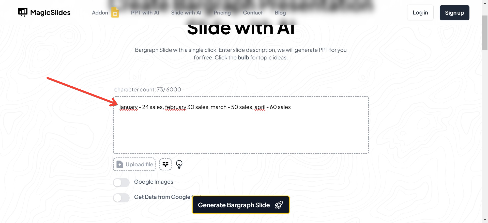
Step 4: Input Your Graph Details
You’ll be prompted to enter the details of your graph. This includes the data points, labels, and any other pertinent information that will be represented in the graph. Fill these out accurately to ensure your graph is both informative and accurate.
Step 5: Choose a Template
MagicSlides.app provides various templates to choose from, allowing you to customize the look of your graph. Select a template that best fits the style and tone of your presentation. Each template is designed to enhance the visual appeal of your data.
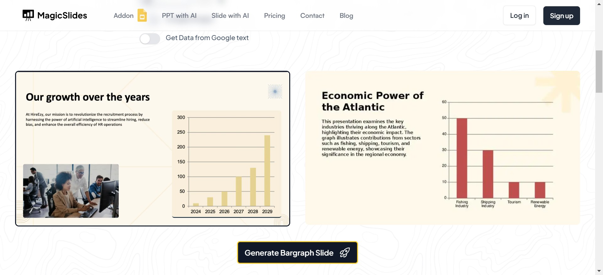
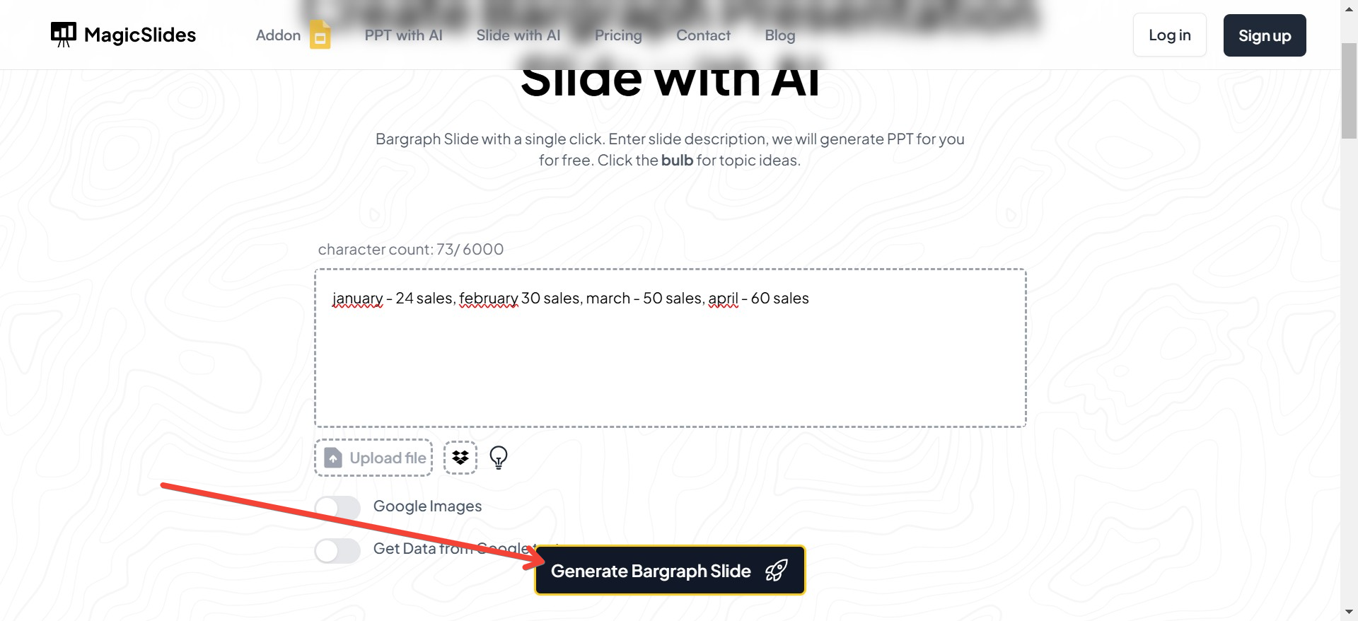
Step 6: Generate Your Slide
With your details filled in and a template selected, click on the “Generate” button. The AI will take over, processing the information you’ve provided and creating a bar graph slide tailored to your specifications. This happens in just seconds!
Step 7: Review Your Graph Slide
Once your graph slide is generated, take a moment to review it. Make sure all the information is correct and that the graph is visually appealing. You can make any necessary adjustments to perfect your slide.
Conclusion: Leveraging AI for Impactful Presentations
Using MagicSlides.app to create your graph presentation leverages cutting-edge AI technology to ensure that your slides are not only beautiful but also highly effective in communicating your message.
This tool allows you to focus more on your presentation’s content and delivery, rather than getting caught up in the nuances of slide design. For your next presentation involving data, turn to MagicSlides.app and create a graph that impresses and informs with ease and style.


