How to Design a Chart Infographic Template for Clear Slides


Learn how to design a chart infographic template flow chart for slides to create clear, engaging presentations. Save time using MagicSlides AI-powered tools.
Over the past three years as a female writer working closely with startups, business owners, and technical teams, I've learned how important clear, visually appealing slides are, especially when you need to communicate complex ideas quickly.
One essential tool I rely on is a chart infographic template flow chart for slides. Today, I'm sharing exactly how I approach designing these templates, best practices that have worked for me, and a time-saving AI tool I genuinely recommend: MagicSlides.app.
Let's dive in!
Why I Always Use a Chart Infographic Template
In my experience, a well-crafted chart infographic template makes a huge difference because it:
- Simplifies complex data: making tough ideas easy to understand.
- Keeps audiences engaged: people naturally connect better with visuals.
- Maintains a professional look: everything stays neat and consistent across slides.
- Saves me tons of time: no more starting from scratch every single time.
I’ve used these templates in business reports, marketing strategies, project updates, and educational decks. Without them, even the best content can feel overwhelming or disconnected.
How I Design a Chart Infographic Template Manually
Sometimes I still create templates manually, especially when I want full creative control. Here’s the step-by-step method I follow:
Step 1: Define the Purpose First
Before I touch a design tool, I ask myself: What exactly am I trying to communicate?
Here are the most common types I choose from:
| Infographic Type | Best Use Case |
|---|---|
| Bar Charts | Comparing performance across periods |
| Flowcharts | Explaining workflows or processes |
| Pie Charts | Showing proportions and percentages |
| Timelines | Mapping out project stages or history |
Step 2: Set Up a Custom Slide Layout
Here’s what I usually do:
- Open PowerPoint and go to View > Slide Master.
- Create a new layout with placeholders for text, charts, and icons.
- Choose a color palette that fits the brand style.
- Save it as a .potx PowerPoint template for reuse.
Step 3: Insert Charts and Build Infographics
To insert a chart:
- Go to Insert > Chart, pick your style, and input your data.
For flowcharts:
- Use Insert > SmartArt > Process to create structured flows.
I always tweak colors and fonts to ensure everything looks clean and cohesive.
Step 4: Enhance with Icons and Whitespace
A few tricks I swear by:
- Use PowerPoint's Icon Library for visual accents.
- Keep plenty of whitespace, it makes a huge difference!
- Use short text labels instead of bulky paragraphs.
By following these steps, I create templates that are functional, stylish, and easy to update.
ChartAI – The AI-Powered Chart Generator in MagicSlides
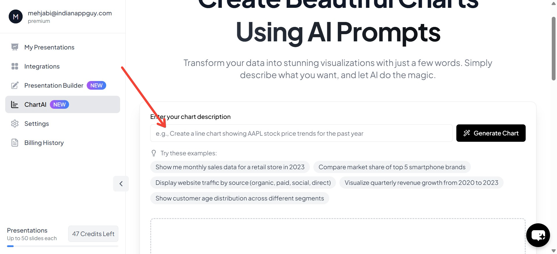
For those who want a faster and automated solution, ChartAI in MagicSlides.app offers AI-driven chart generation, helping you create interactive and visually optimized charts instantly. Whether you need financial charts, sales trends, or market analysis visuals, ChartAI simplifies the process with AI automation.
How to Generate AI-Powered Charts with ChartAI
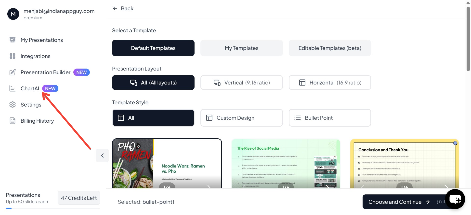
- Visit MagicSlides.app and access ChartAI – After clicking "Generate PPT", navigate to the ChartAI feature in the next step.
- Enter Your Prompt – Describe the chart you need, such as "Generate a bar chart comparing Q1 revenue for 2022 and 2023" or "Create a pie chart showing the percentage of budget allocation across departments."
- Click "Generate Chart" – The AI will process your input and create a data-driven chart based on your description.
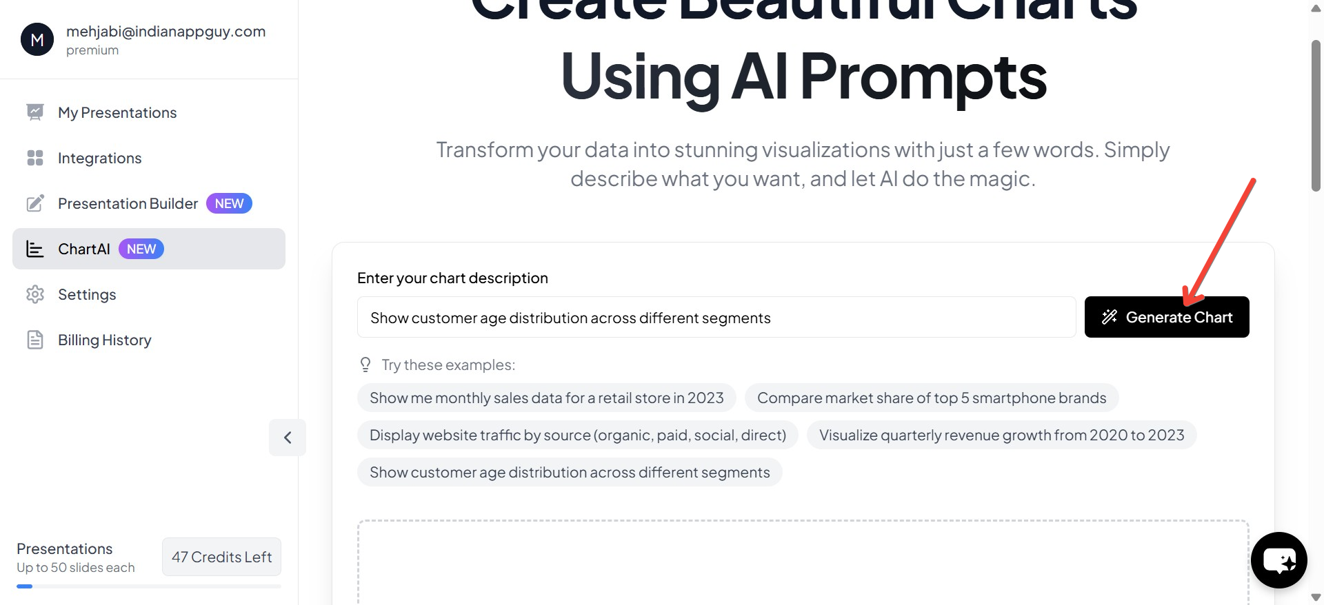
- Your Chart Will Be Generated – Within seconds, ChartAI will provide a professional, visually optimized chart that can be directly inserted into your presentation.
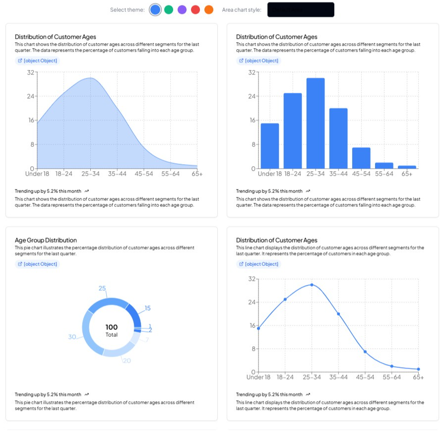
💡 Tip: You can customize the generated chart by tweaking data points, selecting different styles, or modifying labels to match your branding.
👉 Use ChartAI to create impactful, data-rich presentations effortlessly! 🚀
Faster Alternative: Generate a Chart Infographic Template Instantly with MagicSlides
If you do not want to spend hours designing an infographic template manually, MagicSlides.app is an AI-powered tool that can generate custom PowerPoint presentations with chart infographics in seconds.
How to Use MagicSlides.app
- Visit MagicSlides.app
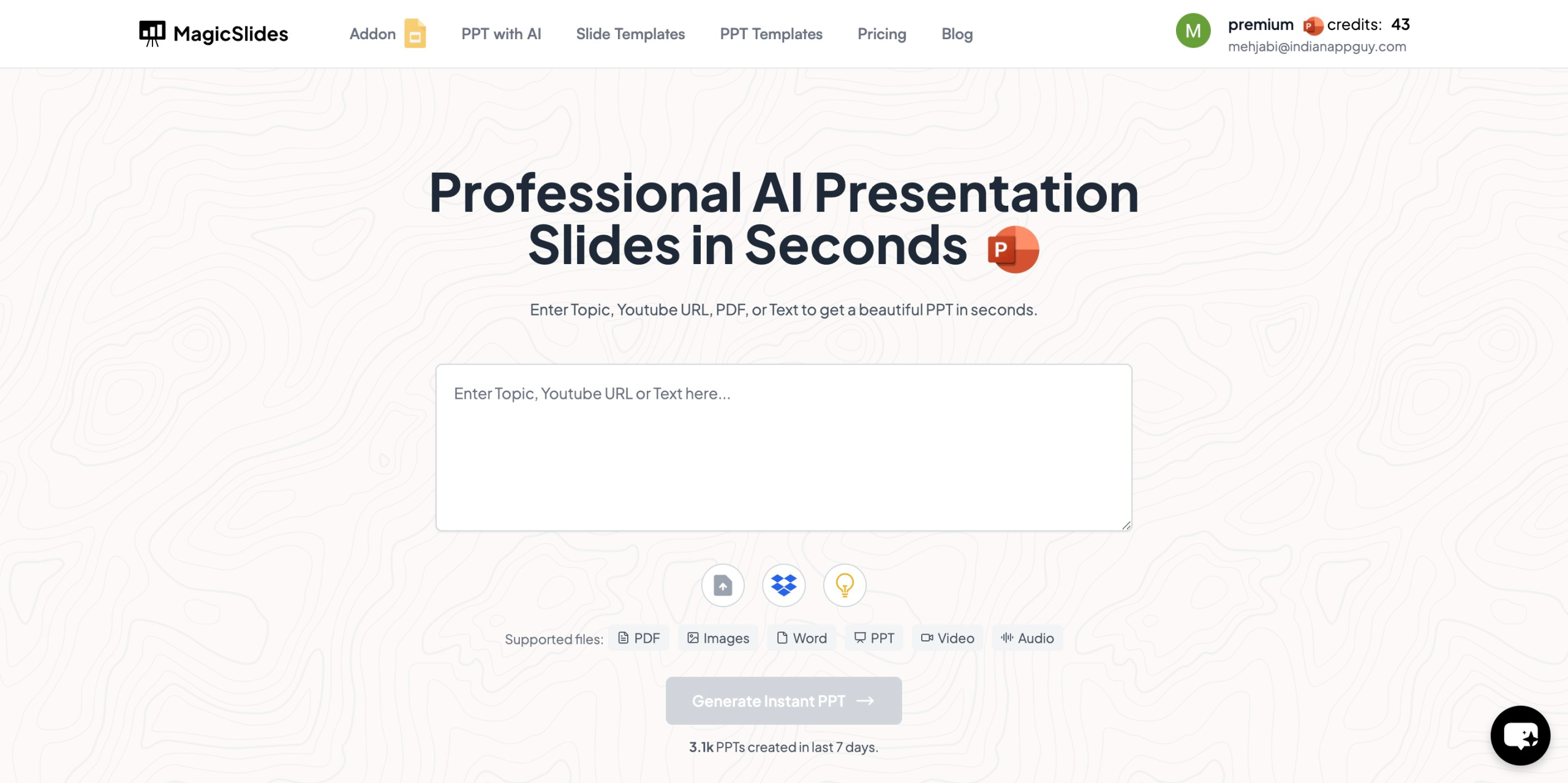
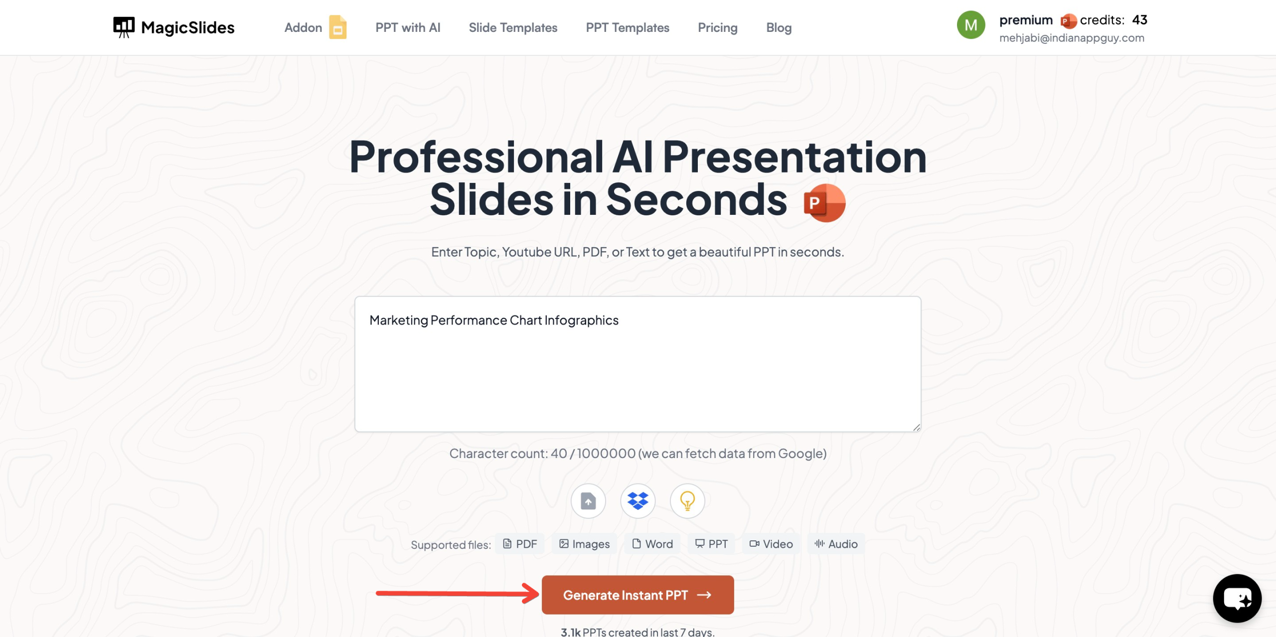
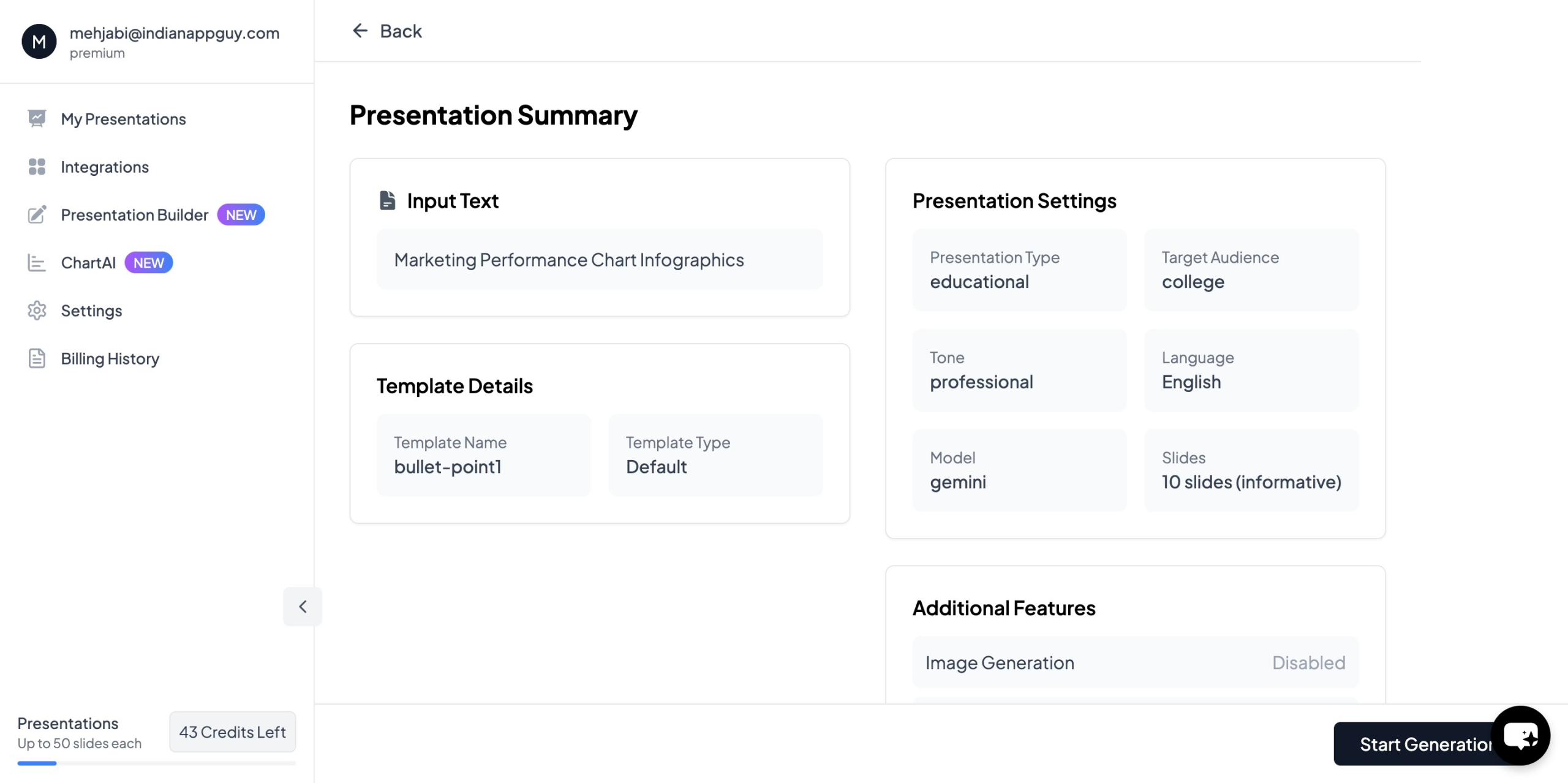
- Enter Your Topic – Type in the presentation title (e.g., "Marketing Performance Chart Infographics").
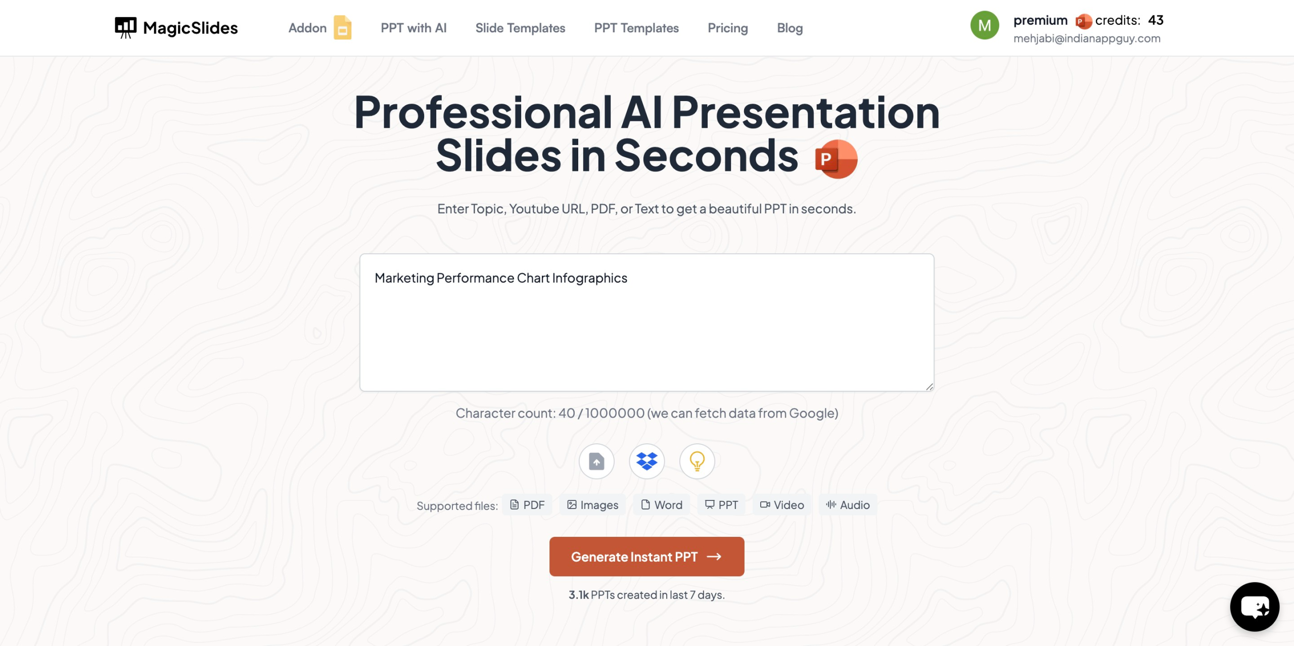
- Click "Generate Instant PPT" – The AI will create slides instantly.
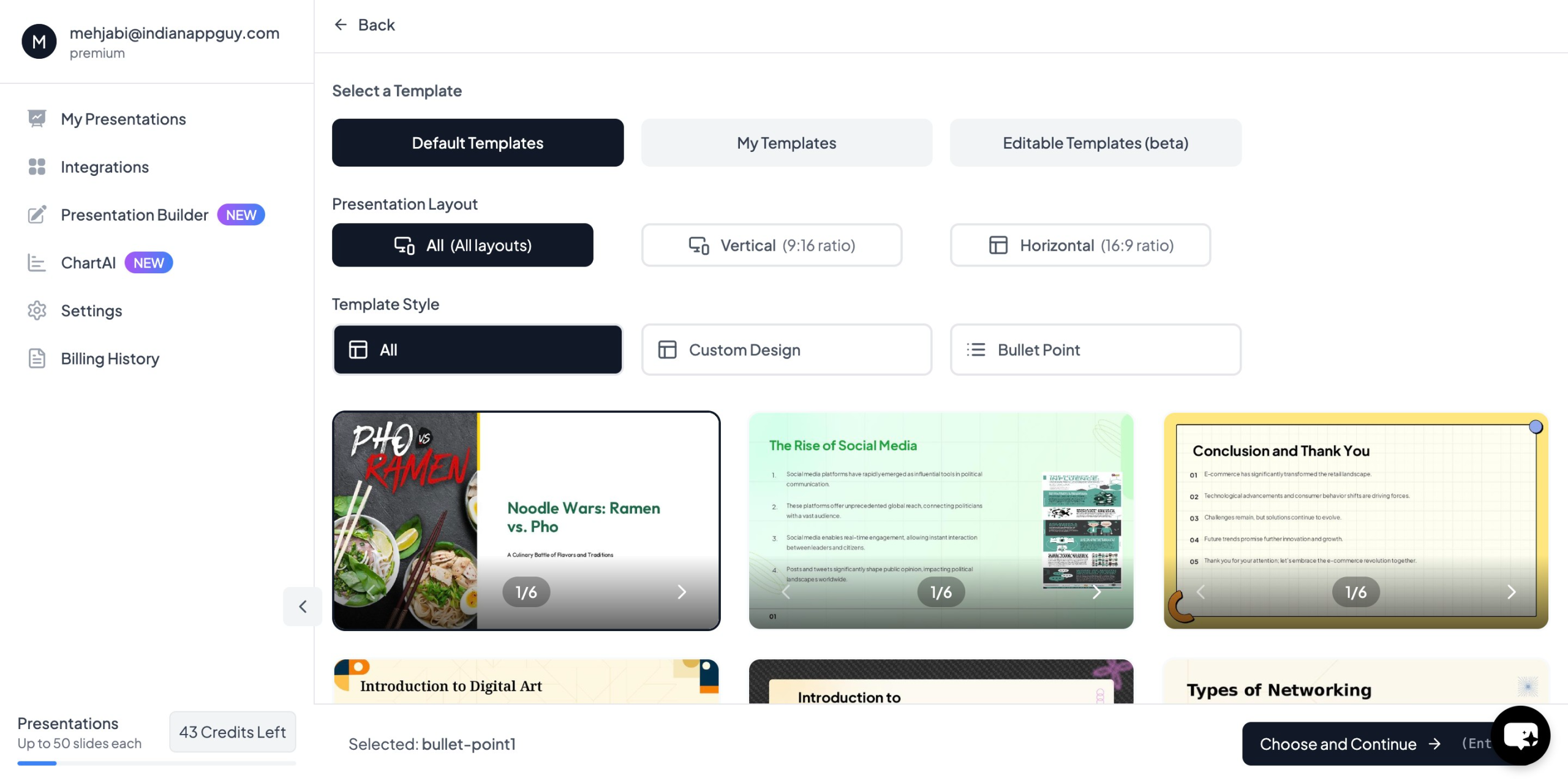
- Choose Your Template and Number of Slides – Customize based on your needs.
- Fill in the Required Details – Adjust slide content as needed.
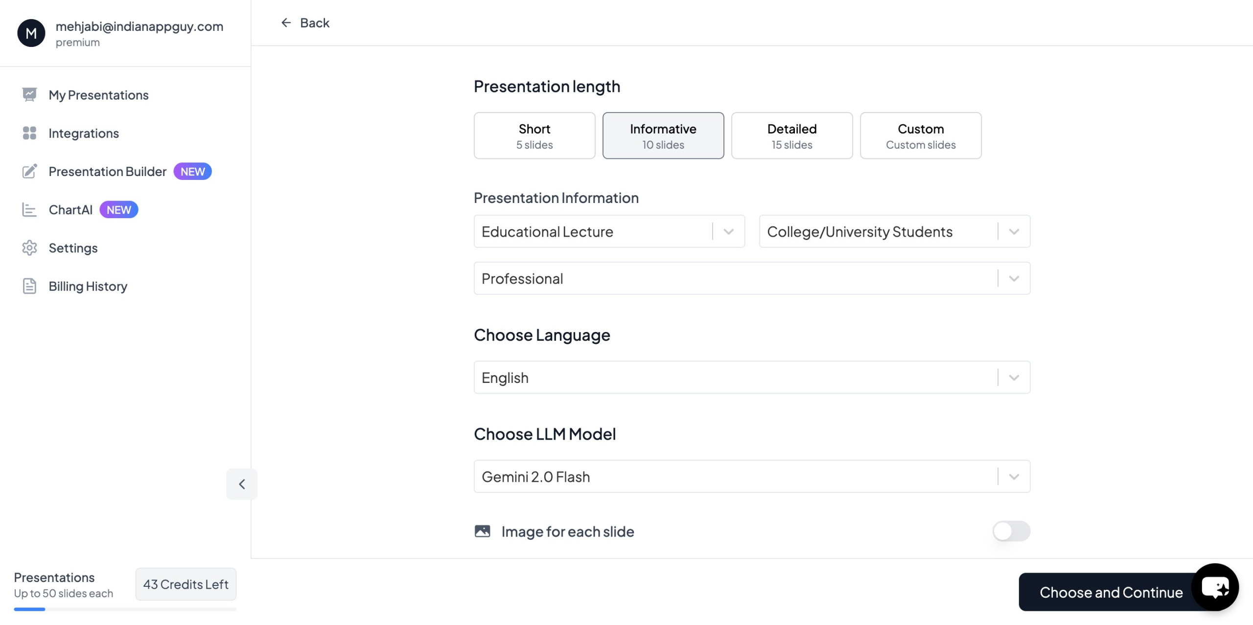
- Click "Start Generation" – Your PowerPoint presentation is ready.
With MagicSlides, you no longer need to manually create charts and infographics, saving time and effort.
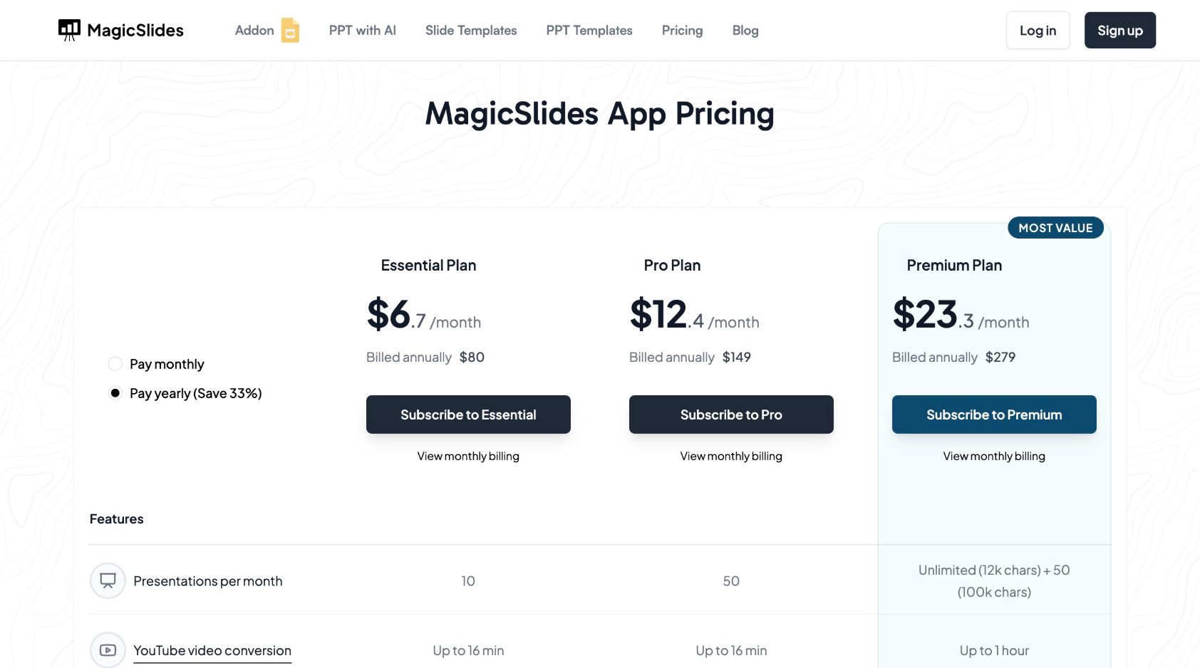
MagicSlides Pricing Plans
MagicSlides offers different pricing plans to accommodate various user needs. Below is a breakdown of the plans available:
Conclusion
Designing a chart infographic template flow chart for slides is no longer a tedious task. Based on my experience, you have two great options:
- Create manually in PowerPoint if you want total control and customization.
- Use MagicSlides.app for fast, professional, AI-generated charts and presentations.
If you’re serious about creating engaging, data-rich presentations without burning hours on design, I definitely recommend giving MagicSlides a try.
👉Ready to make your next presentation stand out? Head over to MagicSlides.app and see how it can transform your workflow!


