How to Effectively Use Typography in Slides


Learn how to effectively use typography in slides to improve readability and engagement. Discover best practices and create presentations instantly with MagicSlides.
Typography is one of the most overlooked aspects of presentation design, yet it plays a huge role in making slides readable, engaging, and professional. The right font choices, sizes, spacing, and colors can make or break how well your audience absorbs your message.
So, if you’ve ever wondered why your slides don’t stand out or why people struggle to follow along, chances are, your typography needs work. In this guide, we’ll break down how to effectively use typography in slides step by step.
Why Typography Matters in Presentations
Poor typography can lead to:
- Eyestrain and frustration
- Audience disengagement
- A lack of emphasis on key points
On the other hand, well-structured typography:
- Makes content easier to digest
- Helps highlight important points
- Creates a polished, professional look
Now, let’s go over the best practices for typography in presentations to ensure your slides look clean and professional.
Best Practices for Using Typography in Slides
1. Choose the Right Font (Stick to Sans-Serif)
Not all fonts are created equal. While serif fonts (like Times New Roman) work great for printed documents, they can be harder to read on slides. Instead, go for sans-serif fonts, which are cleaner and easier to read on screens.
Best fonts for presentations:
- Montserrat
- Open Sans
- Lato
- Roboto
- Poppins
Fonts to avoid:
- Comic Sans
- Papyrus
- Times New Roman (too formal, harder to read on screens)
2. Keep Font Choices Minimal
Using too many fonts makes a slide look cluttered. Stick to:
- One font for headings
- One font for body text
- An optional third font for accents (if necessary)
A good combination: Montserrat for headings + Open Sans for body text.
3. Get Your Font Sizes Right
People should be able to read your slides from the back of the room or across a video call.
Ideal font sizes for slides:
- Headings: 36–44 pt
- Subheadings: 28–36 pt
- Body text: 20–28 pt
- Captions: 16–18 pt
If you find yourself shrinking the text too much, you likely have too much content on one slide.
4. Use Bold, Italics, and Color for Emphasis (But Don’t Overdo It)
To highlight important words, use:
- Bold for key phrases
- Italics for emphasis
- Color to categorize different sections
However, avoid using bold, italics, and color all at once, as it makes text difficult to read.
5. Mind Your Line Spacing (No Cramped Text)
Slides should have enough breathing room between lines of text.
Optimal line spacing:
- Headings: 1.2–1.5x the font size
- Body text: 1.3–1.6x the font size
6. Align Text Properly (Left-Aligned Works Best)
Left-aligned text is the easiest to read for most audiences.
When to use alignment styles:
- Left-aligned – Best for most slides
- Centered – Best for headlines or quotes
- Right-aligned – Rarely needed
7. Contrast is Key (Make Sure Text Stands Out)
Low contrast between text and background makes reading difficult. Always maintain high contrast:
- Dark text on a light background
- Light text on a dark background
- Avoid placing text over busy images
8. Keep Text Minimal (Slides Aren’t Documents)
Slides should support your speech, not replace it. If the audience can read everything from the slides, they might stop listening.
Best practices:
- Use bullet points instead of paragraphs
- Keep each slide to 6-8 words per line, 5-7 lines per slide
- Replace unnecessary text with visuals
How to Instantly Create Presentation Slides with MagicSlides
Want to make professional slides without spending hours designing them? Try MagicSlides, an AI-powered tool that generates entire presentations for you.
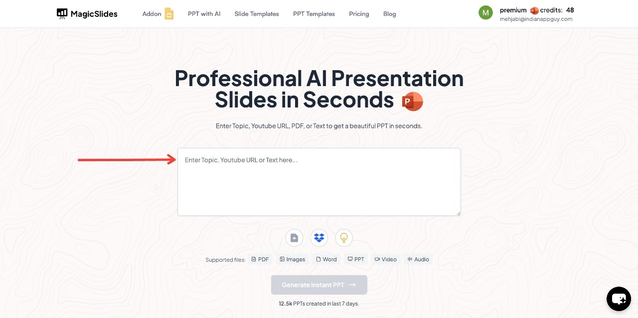
Steps to Use MagicSlides.app
- Visit MagicSlides.app
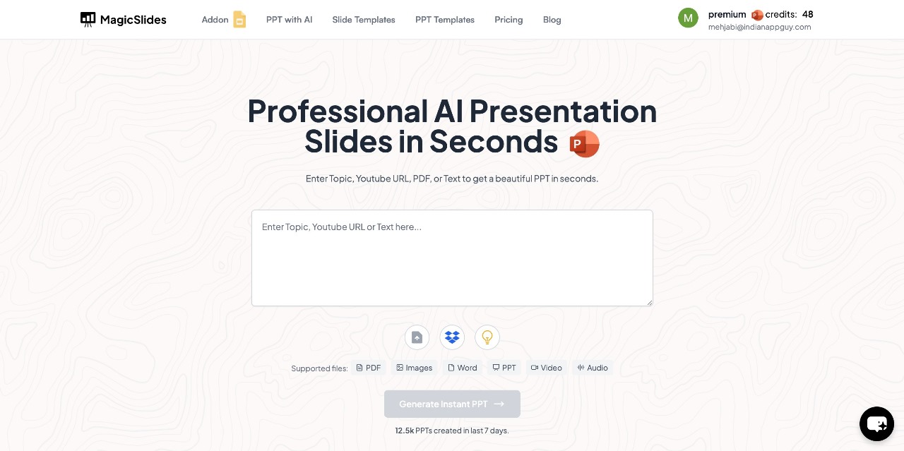
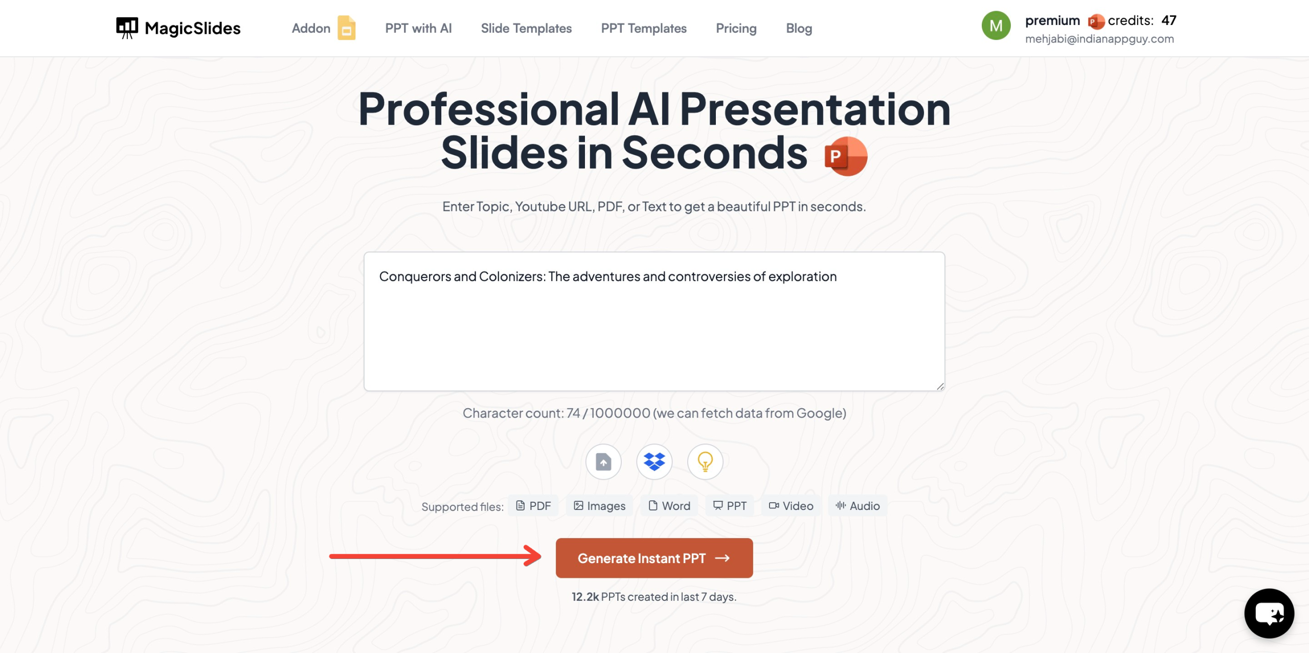
- Enter your topic in the provided space
- Click "Generate Instant PPT" to start the process
- Choose your template and number of slides as prompted
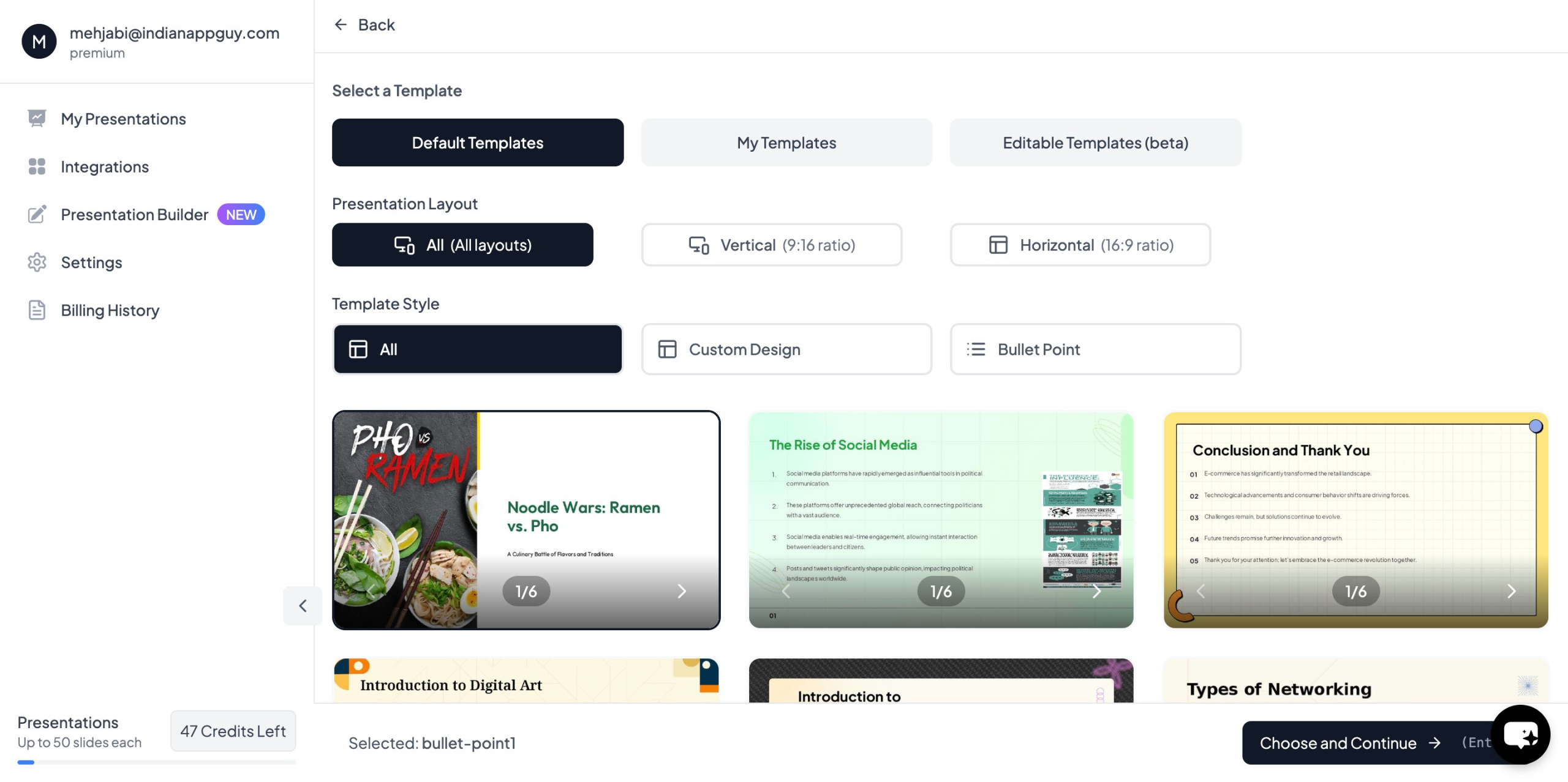
- Fill in the required details, then click "Generate Instant PPT"
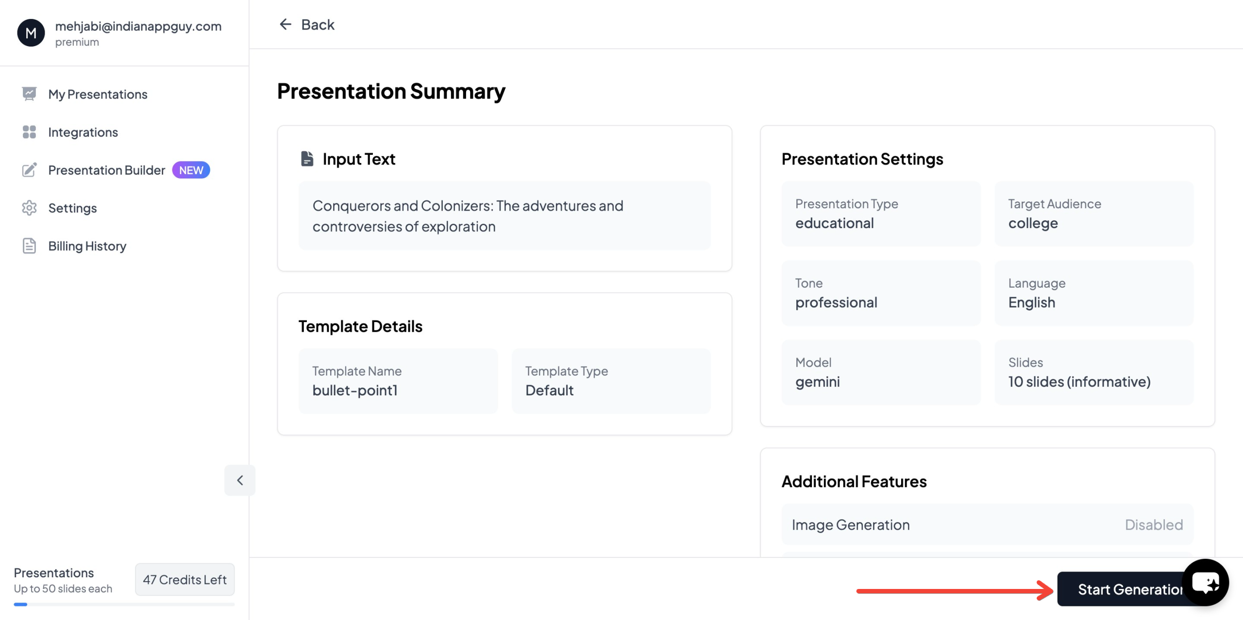
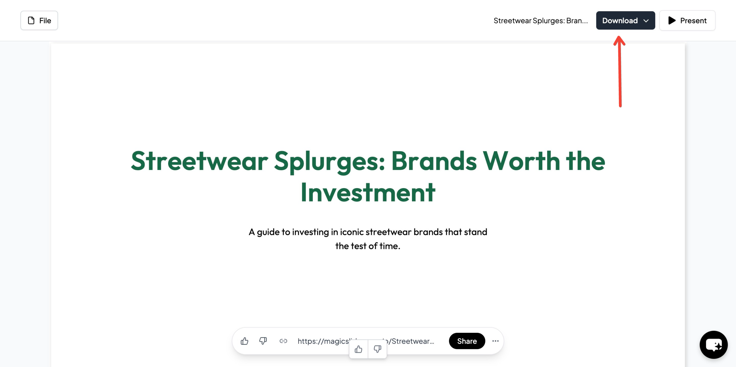
- Your professionally designed presentation will be ready in seconds
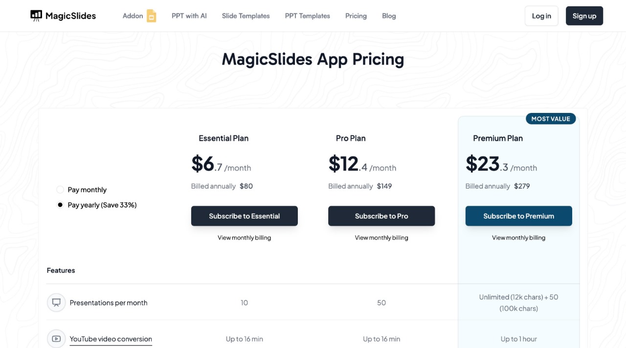
MagicSlides Pricing & Features
MagicSlides offers flexible plans depending on your needs:
Why Use MagicSlides?
- Saves time – No need to manually design slides
- AI-powered – Generates content based on your topic
- Customizable – Choose templates and layouts that fit your style
- Integrations – Works with Google Slides, Figma, Zapier, and more
If you want to create high-quality presentations in minutes, give MagicSlides a try.
Final Thoughts
Typography is one of the most important design elements in your slides. When done right, it makes your presentation clear, engaging, and professional.
- Stick to clean, sans-serif fonts
- Keep font choices minimal (1-2 fonts max)
- Use proper sizing, spacing, and contrast for readability
- Avoid text-heavy slides – your audience should listen, not just read
And if you don’t want to spend hours making slides, MagicSlides can do the hard work for you in seconds. Try it out at MagicSlides.app.


