What Is an Infographic Presentation? Examples, Types & How to Create One


Learn what an infographic presentation is, explore types and examples, and discover how to create engaging infographic slides with PowerPoint or AI tools like MagicSlides.
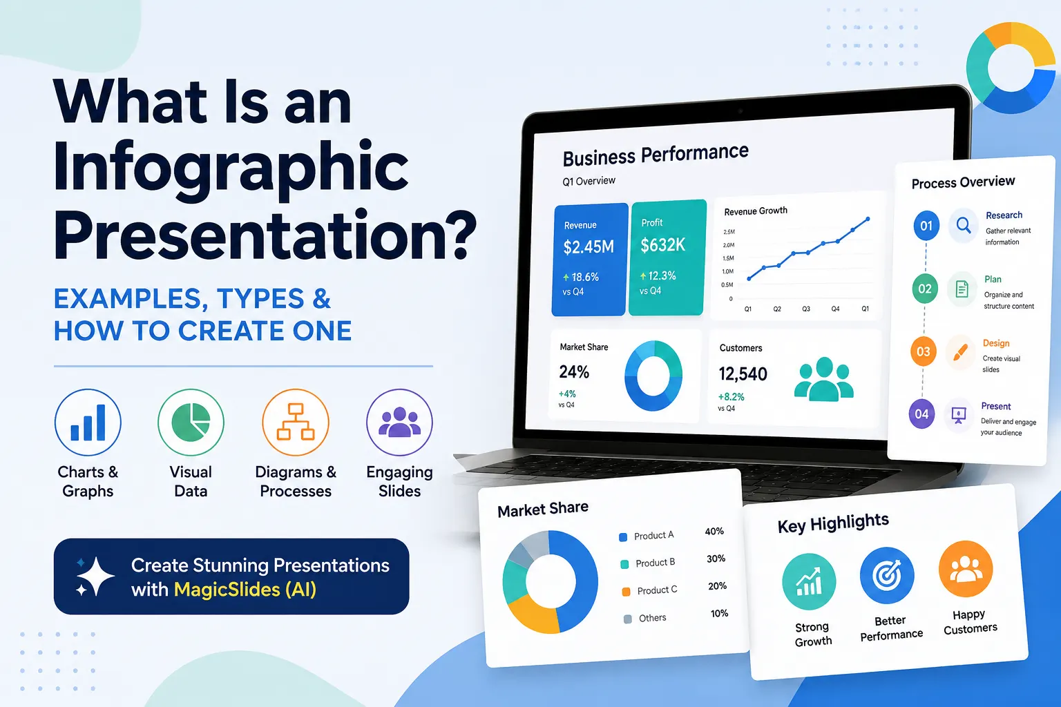
An infographic presentation is a visual presentation that uses charts, graphs, icons, diagrams, statistics, images, and concise text to communicate information clearly across a series of slides. Unlike text-heavy presentations, it focuses on visual storytelling to help audiences understand complex ideas, data, and processes more quickly.
Infographic presentations are commonly used in business reports, marketing, education, research, sales, and data analysis. They can turn large amounts of information into clear, engaging slides that are easier to scan and remember.
In this guide, you’ll learn what an infographic presentation is, how it differs from a traditional presentation, the different types and examples, and how to create an effective infographic presentation using PowerPoint or AI tools like MagicSlides.
What Is an Infographic Presentation?
An infographic presentation is a slide-based presentation that uses visuals such as charts, graphs, icons, diagrams, statistics, and concise text to communicate information clearly.
Unlike a text-heavy presentation, it focuses on visual storytelling, making complex information easier to understand and remember.
Infographic presentations are commonly used for:
- Business reports and data
- Marketing and sales
- Education and training
- Research and presentations
- Processes, comparisons, and trends
The goal is not simply to make slides attractive, but to use visuals to communicate the main message quickly and effectively.
Infographic Presentation vs. Traditional Presentation
An infographic presentation and a traditional presentation both use slides to communicate information, but they approach that information differently. A traditional presentation may rely more on headings, paragraphs, bullet points, and spoken explanations. An infographic presentation, on the other hand, puts visual communication at the center of each slide.
For example, a traditional business presentation might explain quarterly performance using several sentences and a basic table. An infographic presentation could communicate the same information through a growth chart, percentage indicators, icons, and short supporting statements. The audience can understand the key message without reading large amounts of text.
This does not mean infographic presentations are always better than traditional presentations. The best format depends on the topic, audience, and purpose. Detailed explanations may benefit from a more traditional structure, while data-heavy or complex topics can often be communicated more effectively through infographic-style slides.
The main difference is therefore how information is presented. Traditional presentations tend to explain information through content and narration, while infographic presentations use visual storytelling to make information easier to understand at a glance.
What Are the Key Elements of an Infographic Presentation?
An effective infographic presentation combines clear content with purposeful visuals. The key elements include:
- Visual hierarchy: Organizes information so the most important points stand out first.
- Charts and graphs: Make data, statistics, and trends easier to understand.
- Icons and illustrations: Simplify concepts and add visual context.
- Diagrams and timelines: Explain processes, relationships, and sequences.
- Concise text: Supports the visuals without overcrowding the slide.
- Consistent design: Maintains a cohesive look through typography, spacing, and visual style.
The best infographic slides use these elements to explain information, not simply decorate it.
Types of Infographic Presentations
The right infographic format depends on the type of information you want to communicate.
| Type of Infographic | Best Used For | Common Visuals |
|---|---|---|
| Statistical | Data, metrics, and research findings | Charts, graphs, percentages |
| Process | Steps, workflows, and procedures | Arrows, flowcharts, diagrams |
| Timeline | Events, milestones, and historical information | Dates, lines, chronological layouts |
| Comparison | Comparing products, ideas, or subjects | Side-by-side layouts, charts |
| List | Facts, tips, ideas, or multiple items | Icons, numbered sections |
| Informational | Explaining a topic or concept | Icons, illustrations, short text |
Choosing the right type helps make an infographic presentation clearer, more engaging, and easier for the audience to understand.
Infographic Presentation Examples
Infographic presentations can be used across different industries and subjects to turn complex information into clear visual stories.
| Example | What It Can Show | Useful Visuals |
|---|---|---|
| Business Presentation | Revenue, growth, KPIs, and market share | Charts, statistics, icons |
| Marketing Presentation | Campaign results, customer data, and trends | Graphs, percentages, illustrations |
| Educational Presentation | Concepts, processes, and key facts | Diagrams, timelines, icons |
| Research Presentation | Findings, survey results, and insights | Charts, graphs, data visualizations |
These infographic presentation examples show how the same visual format can be adapted to different audiences and purposes. The key is to choose visuals that make the information easier to understand rather than simply adding graphics to the slides.
What Is an Infographic PPT?
An infographic PPT is a PowerPoint presentation that uses visual elements such as charts, graphs, icons, diagrams, statistics, and concise text to communicate information across slides. Infographic PowerPoint presentations are useful for presenting data, explaining processes, comparing information, and summarizing reports.
PowerPoint provides tools for creating these visual slides, but designing each element manually can take time. AI presentation tools can help speed up the process by turning existing content into structured presentation slides.
How to Create an Infographic Presentation?
Creating an infographic presentation starts with a clear topic and a focused message. Follow a simple process to keep the presentation useful and visually engaging:
- Define your topic: Decide what you want your audience to learn.
- Organize your information: Select the most important facts, data, and ideas.
- Choose the right format: Use charts, timelines, diagrams, or comparisons based on your content.
- Design focused slides: Give each slide one clear idea and keep the text concise.
- Maintain visual consistency: Use consistent fonts, layouts, spacing, and graphics.
- Review the presentation: Make sure every visual supports the message and the information is easy to understand.
A good infographic presentation combines accurate information, clear structure, and purposeful visual design rather than simply adding graphics to traditional slides.
How to Create an Infographic Presentation With AI
AI presentation tools can simplify the process of turning information into a structured, visual presentation. Instead of starting with a blank slide, you can provide your topic or existing content and let AI help organize it into slides.

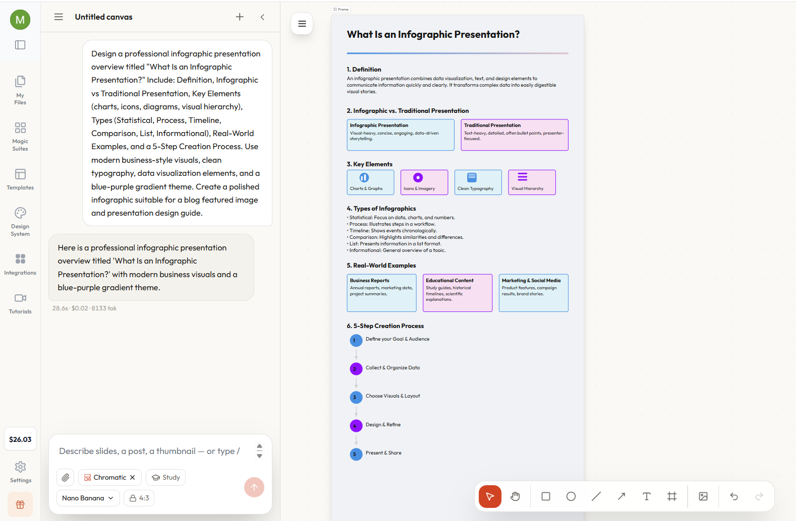
With MagicSlides, you can turn your content into a presentation and then refine the generated slides to match your topic, audience, and presentation style.
For additional visual content, Magic Canvas, an AI Design Generator, can be used to create and edit assets such as social posts, carousels, and thumbnails. This makes it useful when you need to adapt the visual ideas from your presentation into other formats.

AI can help with:
- Structuring content into a logical slide flow
- Summarizing information into concise slide text
- Creating visual presentation layouts
- Turning complex information into easier-to-follow slides
You should still review the generated presentation for accuracy, clarity, and visual consistency. AI can speed up the creation process, while your input ensures the final infographic presentation communicates the right message.
Best Practices for an Effective Infographic Presentation
An effective infographic presentation should make information easier to understand, not simply make slides look more attractive. Start by giving each slide one clear purpose so the audience can quickly identify the main message.
Keep text concise and use visuals to communicate information wherever possible. Charts, diagrams, icons, and illustrations should directly support the content rather than distract from it. When presenting data, choose a chart type that makes the relationship between the numbers easy to understand.
Consistency also matters. Use a coherent visual style, readable typography, appropriate spacing, and a consistent layout throughout the presentation. Avoid overcrowding slides with too many colors, graphics, or data points.
Finally, consider your audience. A presentation for business professionals may require a different visual approach from one designed for students. The best infographic presentations balance attractive design with clarity, ensuring that the audience can understand the key message without unnecessary effort.
Conclusion
An infographic presentation combines clear storytelling with visual communication to make complex information easier to understand. By using charts, diagrams, icons, statistics, and concise text, it can turn data and ideas into engaging, easy-to-follow slides.
The key to an effective infographic presentation is choosing the right visuals, keeping each slide focused, and maintaining a consistent design. Whether you’re creating a business report, educational presentation, marketing deck, or data summary, the right visual approach can make your message more memorable.
With AI tools like MagicSlides, creating these presentations can also become faster and more efficient. Instead of building every slide from scratch, you can start with your content, generate a presentation, and refine it to fit your needs.
Also read: How to Do Hanging Indent on Google Slides: Step-by-Step Guide
Frequently Asked Questions About Infographic Presentations
Q1. What is an infographic presentation?
An infographic presentation is a slide-based presentation that uses visual elements such as charts, icons, diagrams, illustrations, and concise text to communicate information clearly and quickly.
Q2. What are the main types of infographics?
Common types include statistical, process, timeline, comparison, list, and informational infographics. The best type depends on whether you are presenting data, explaining a process, comparing subjects, or organizing information.
Q3. Can you create an infographic presentation in PowerPoint?
Yes. PowerPoint provides tools for creating charts, diagrams, shapes, icons, and other visual elements that can be combined into infographic slides. You can also use an AI presentation tool to speed up the creation process.
Q4. Can AI create an infographic presentation?
Yes. AI PPT tools such as MagicSlides can help turn a topic or existing content into structured presentation slides. You can then review and customize the generated presentation to suit your audience and purpose.
Also read: How to Insert Excel in PPT – Quick Steps to Add Excel to PowerPoint


