How to make a Data Analytics PPT


Create stunning Data Analytics presentations in minutes using AI-powered MagicSlides no design skills needed
How to Make a Data Analytics PPT Using MagicSlides
Creating a Data Analytics PowerPoint presentation can be a time-consuming task, especially when you're focused on insights, charts, and communicating complex data clearly. But what if you could automate the process and still end up with a polished, professional-looking deck?
That’s where MagicSlides Web App comes into play. It’s an AI-powered tool that helps you turn your input into a complete presentation perfect for analysts, consultants, or students preparing reports or presentations. With just a few clicks, you can save hours and generate a high-quality Data Analytics PPT.
Step-by-Step Guide: How to Make a Data Analytics PPT with MagicSlides
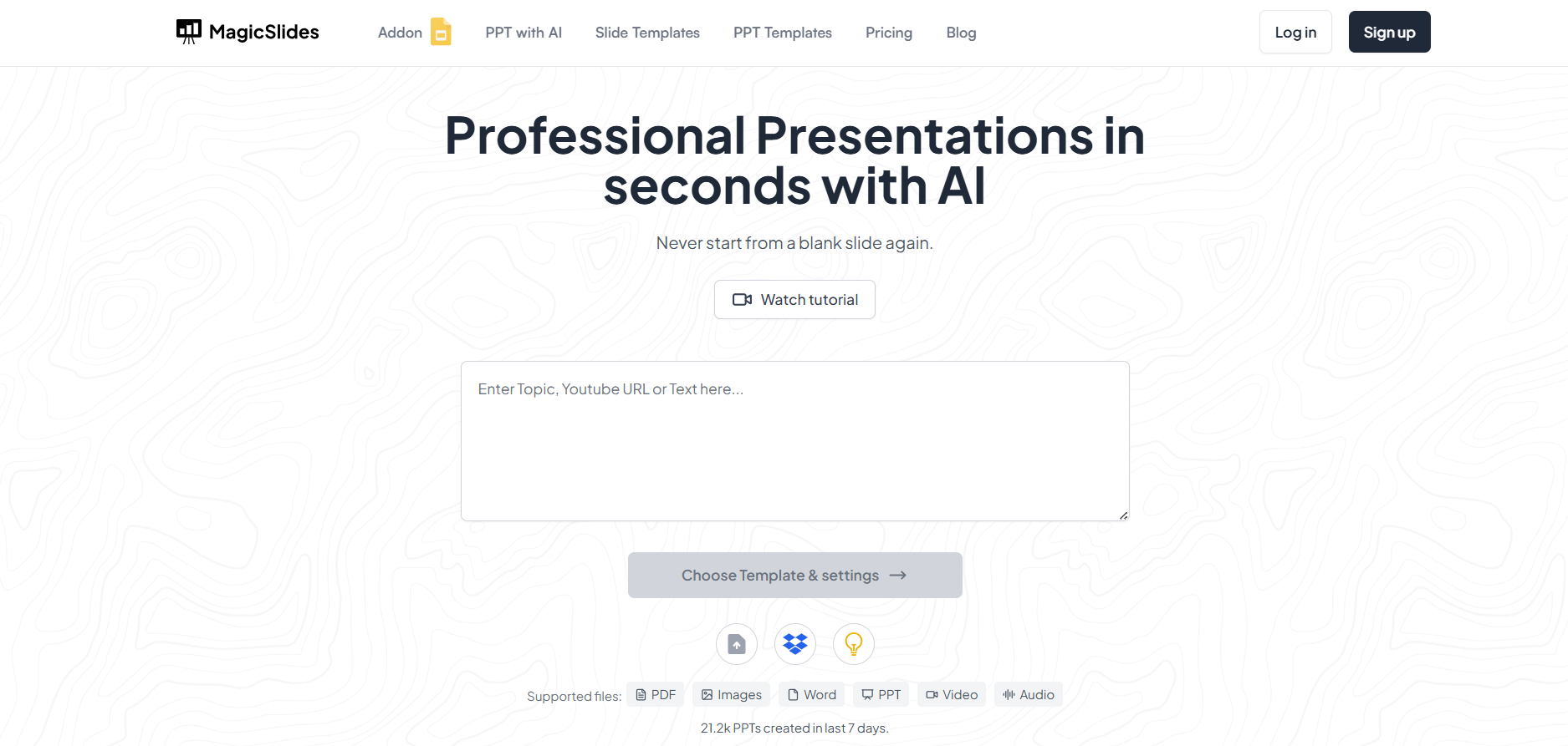
Step 1: Visit MagicSlides Web App
Head over to MagicSlides.app using your browser.
Step 2: Enter Your Topic or Prompt
In the input field, type something like:

“Create a PowerPoint on Data Analytics for E-commerce Business”
You can also specify key points like:
- Types of data analytics (descriptive, diagnostic, predictive, prescriptive)
- Use cases in business
- Tools used (Power BI, Tableau, Python, etc.)
- Real-world examples or case studies
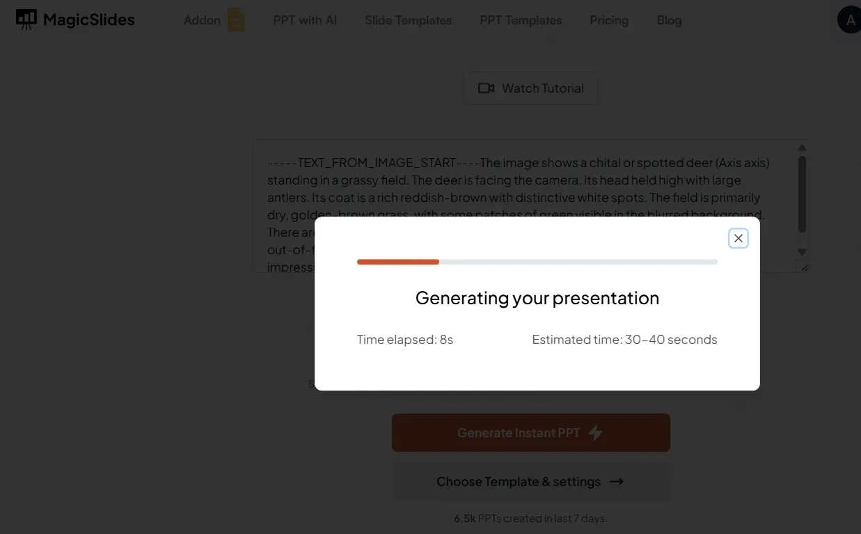
Step 3: Click “Generate Presentation”
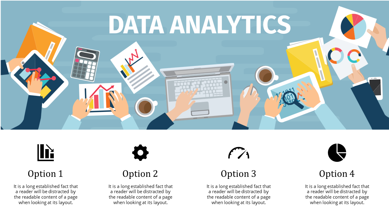
The AI will process your prompt and create a full slide deck, including headings, bullet points, and sometimes even chart placeholders.
Step 4: Review and Make Edits (Optional)
Go through the generated presentation and make any changes as needed. Add your charts, graphs, or brand elements.
Step 5: Download Your PPT
Once you’re satisfied, download the .pptx file. You can open it in Microsoft PowerPoint, Google Slides, or any presentation software.
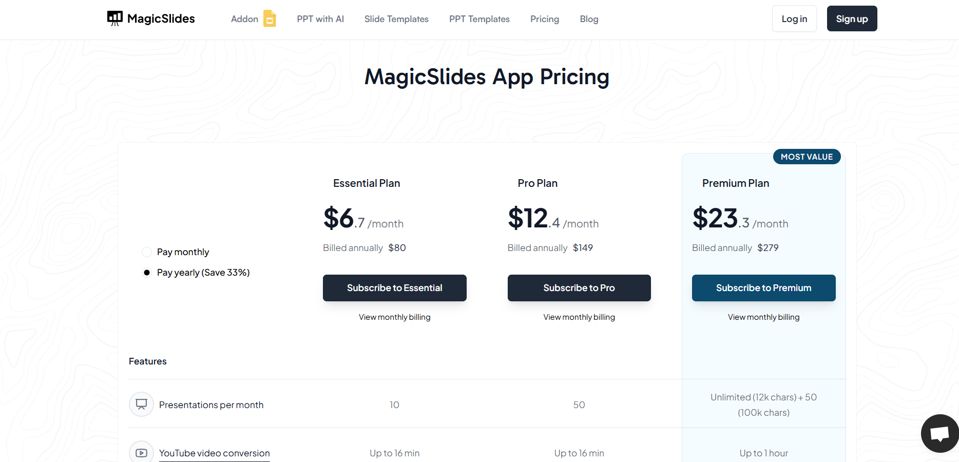
Step 6: Consider Upgrading for More Features
If you're working on multiple presentations or need access to premium slide themes and longer outputs, you can upgrade your MagicSlides account for enhanced capabilities.
Conclusion
Data storytelling is as important as the analysis itself. Using MagicSlides to create your Data Analytics presentation not only saves valuable time but also enhances the visual appeal of your work.
Whether you're presenting to stakeholders, a classroom, or at a conference, MagicSlides ensures you focus on insights, while it takes care of the design.


