What is a Sad Font on Google Slides


Choose the perfect sad font in Google Slides to create an emotional, melancholic, or nostalgic presentation
What Is a Sad Font on Google Slides?
Fonts play a crucial role in setting the mood of a presentation.
If you want to convey emotions like sadness, melancholy, or seriousness in Google Slides, choosing the right font is important.
This guide will help you find fonts that best represent a sad or somber tone and show you how to apply them effectively in your presentation.
Best Sad Fonts in Google Slides
Step 1: Understanding the Characteristics of a Sad Font
Sad fonts typically have the following traits:
Thin or delicate strokes – To create a fragile, emotional feel.
Italic or handwritten styles – To mimic handwritten notes or sorrowful letters.
Soft or faded appearance – To create a nostalgic or somber atmosphere.
Step 2: Selecting a Sad Font in Google Slides
Google Slides has several fonts that convey sadness or melancholy:
- Dancing Script – Has a handwritten, poetic feel.
- Pacifico – Soft, rounded strokes create a nostalgic tone.
- Great Vibes – Elegant and sorrowful, perfect for reflective presentations.
- Italianno – Flowing script with a sentimental feel.
- Montserrat Light – Thin and subtle, giving a subdued, serious mood.
To select a font in Google Slides:
Open your Google Slides presentation.
Click on a text box and highlight the text.
Go to the Font dropdown menu in the toolbar.
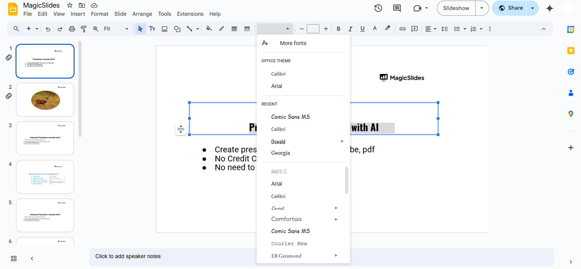
Scroll through or click More fonts to explore additional options. Select a font that matches the emotional tone of your slide.
Step 3: Enhancing the Mood with Font Styling
Once you’ve chosen a font, adjust it to strengthen the mood:
- Use lowercase letters – Avoid all caps, as they feel bold and aggressive.
- Reduce opacity – Light gray or faded text can add to the somber tone.
- Apply italics – Gives the text a soft, flowing, and handwritten appearance.
- Use dark or muted colors – Shades like deep blue, gray, or faded black enhance the emotional impact.
Step 4: Pairing Sad Fonts with Backgrounds and Images
- Use a dark, cloudy, or grayscale background – This helps set a serious or sad mood.
- Avoid bright or vibrant colors – They can contrast too much with the emotional theme.
- Use images with soft lighting or shadows – Enhances the storytelling aspect of sadness.
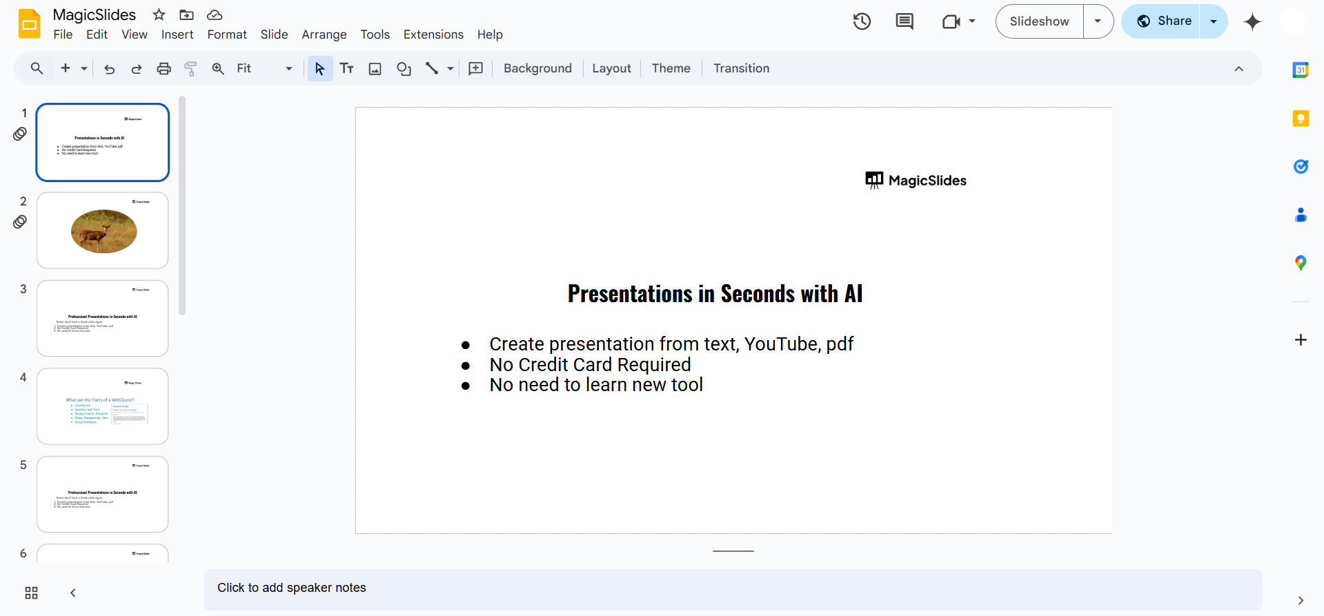
Fonts like 'Caveat' or 'Dancing Script' can add an emotional tone to your slides. But if you want AI-powered slides with the perfect fonts, layouts, and visuals in seconds, try MagicSlides.app effortless and professional presentations!
Conclusion
Sad fonts in Google Slides help convey emotions like grief, nostalgia, or seriousness.
Fonts like Dancing Script, Great Vibes, and Montserrat Light can create the perfect mood when combined with proper styling, colors, and background choices.
FAQs About Sad Fonts in Google Slides
What is the saddest font available in Google Slides?
Fonts like Great Vibes, Pacifico, and Dancing Script are commonly used to evoke sadness.
How do I make text look emotional in Google Slides?
Use thin, italicized fonts, muted colors, and faded effects to enhance emotional depth.
Can I add custom sad fonts to Google Slides?
Yes! You can use the More fonts option or upload custom fonts through Google Fonts.
Now you can create presentations that capture deep emotions and effectively convey your message! 🎭


